Disclaimer: I purchased this watch on the secondary market, and was not externally incentivized in any way to make this review. This review is in no way sponsored by MING, or any entity. All opinions here are my own.
Contents
17.06 Copper
This is the fourth MING watch that I’ve bought and reviewed, and is the third I’ve picked up on the secondary market. If you watched my review of the 27.01, I talk about some of the reasons why I enjoy the MING design language, and why I’m drawn to this brand in general. I know there’s been a lot of controversy lately, and I don’t want to get into it here as that isn’t the purpose of this review.
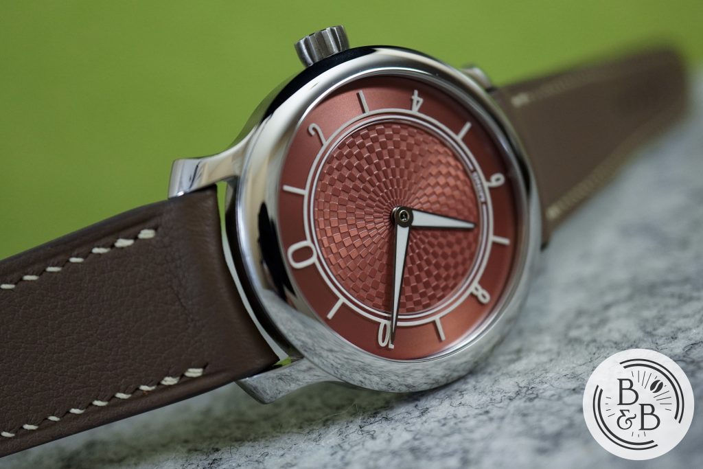
This is the 17.06 in copper and is one of 300 pieces made in 2019. This was a follow up to their debut release, the 17.01, and I reviewed that watch on my channel last year. This watch had a retail price off CHF 1250, which is roughly $1350 USD. I paid significantly more for this watch, but I plan to review it as I would another $1350 watch. And that hefty premium can be thought of as a measure of how badly I wanted it.
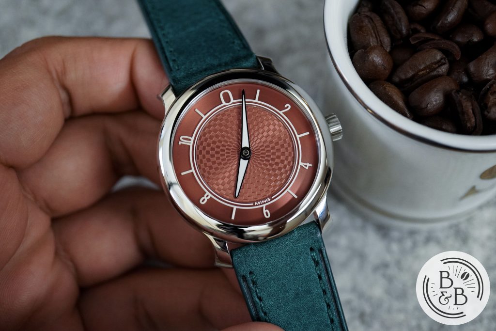
And why did I want it that badly? I love the dial color and updated dial design from the 17.01, and I think MING nailed the copper/salmon tones with this watch and were slightly ahead of the curve. This watch also won a GPHG Award in 2019 in the Horological Revelation category, and I think that played a crucial role in MING‘s meteoric rise to fame.
Let’s check it out!
Case
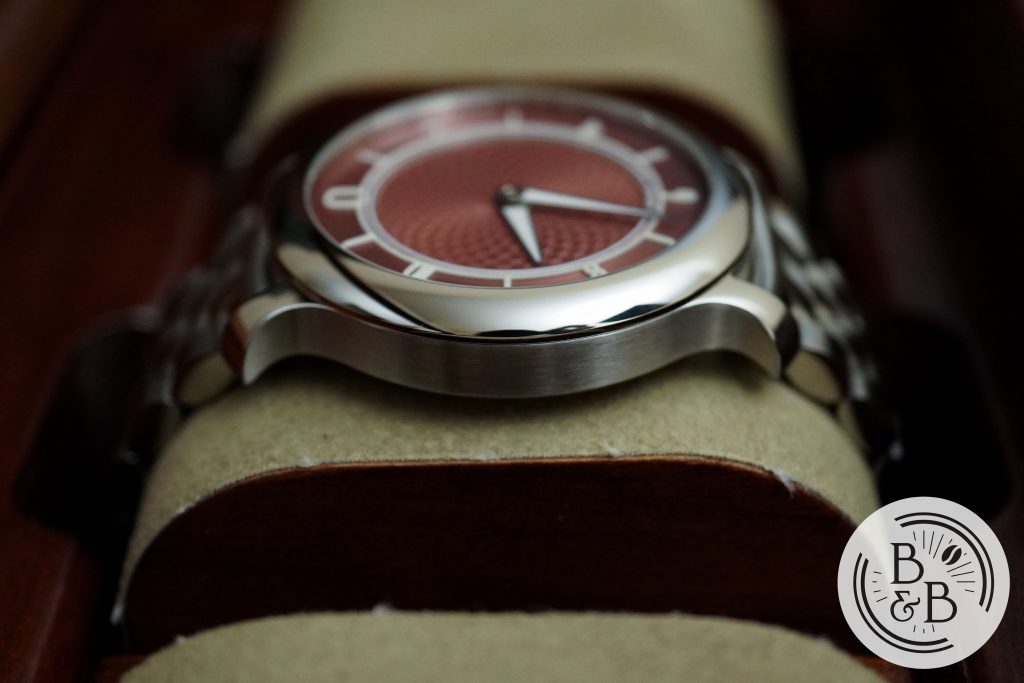
I measured the case to be 38 mm in diameter, 44 mm from lug-to-lug and 10.1 mm in height. The case shape and proportions are nearly identical to the MING 17.01. Apart from the minor difference in height, the 17.06 is made of stainless steel and not titanium. I’ve had two titanium and two stainless steel MING watches, and I think I prefer the steel ones. The additional weight helps it feel more ‘substantial‘, and I think their steel looks a bit nicer when polished too.
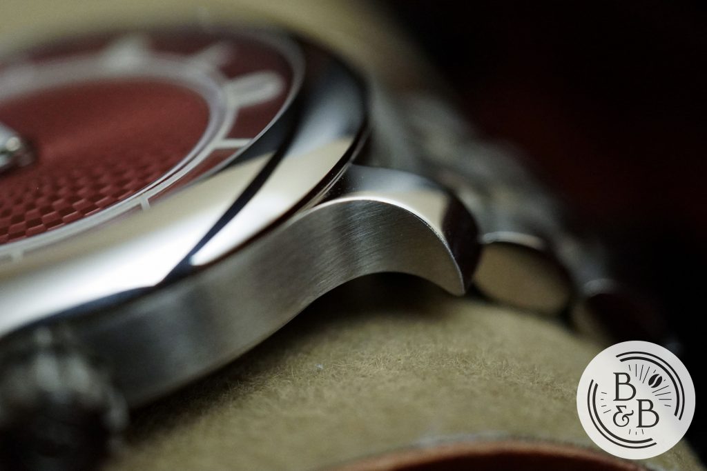
The sides of the case are brushed, and extend out into their polarizing but unique flared lugs. I personally love these lugs, and I think this design went a long way in differentiating MING from all the other watches out there. Coming up with creative dial designs is something micro-brands try to do all the time, but they end up failing to differentiate themselves by picking off the shelf case designs. For example, the latest Dietrich SD-1 skin diver has a great dial design, but has a case that looks indistinguishable from other micro-brands like NTH, Raven, etc.
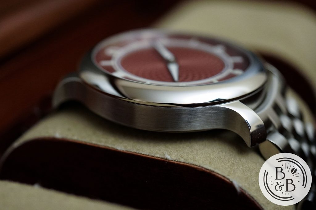
You then have a polished fixed bezel section that seats a flat sapphire crystal. The polishing on the bezel is excellent, and the whole case design feels very cohesive without any abrupt transitions.
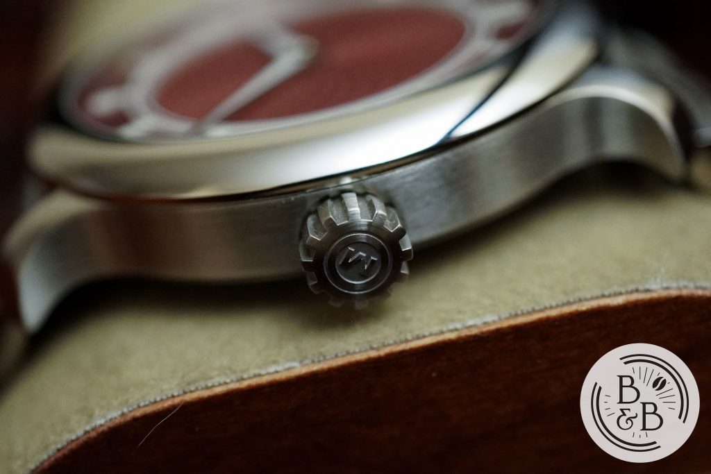
You have a 5.35 mm push-pull crown at the 3 o’clock position that has MING‘s standard crown design that resembles a mechanical gear, with deep ridges that make it easy to grip and operate.
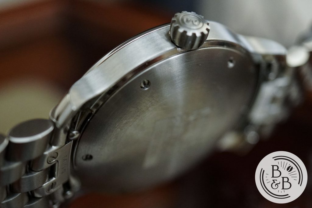
Flipping it over, you have a solid-case back that is attached to the case by means of screws. This watch is rated for up-to 100m of water resistance, which I think is pretty good for a dressy sports watch.
Dial
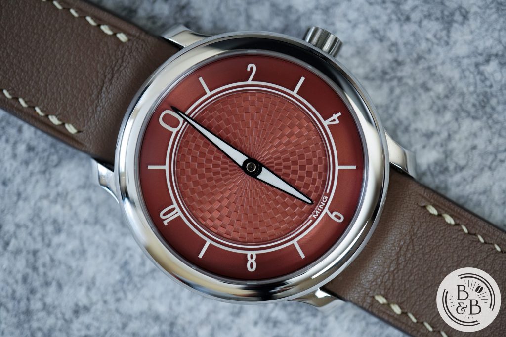
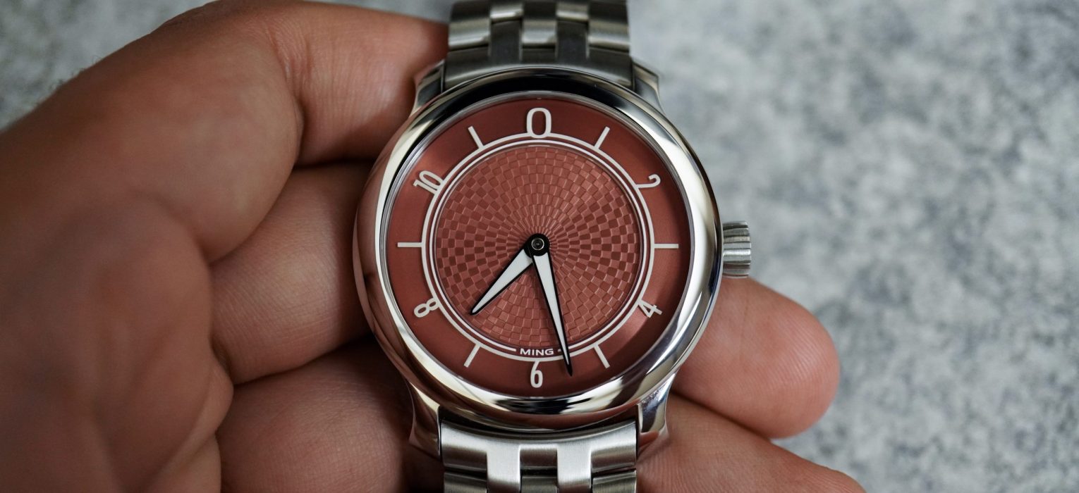
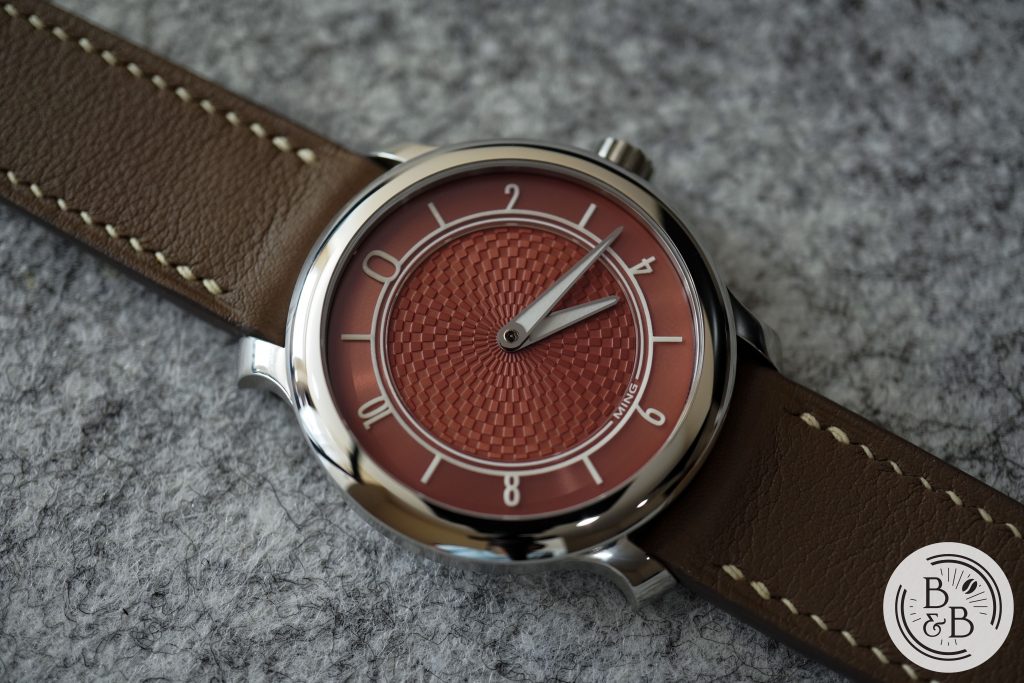
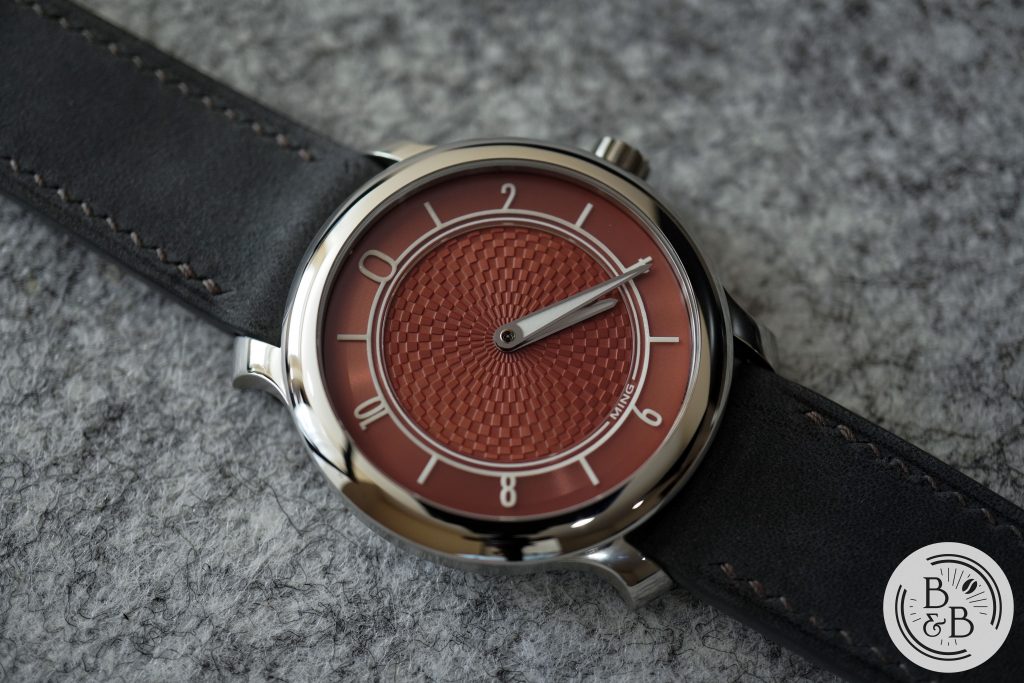
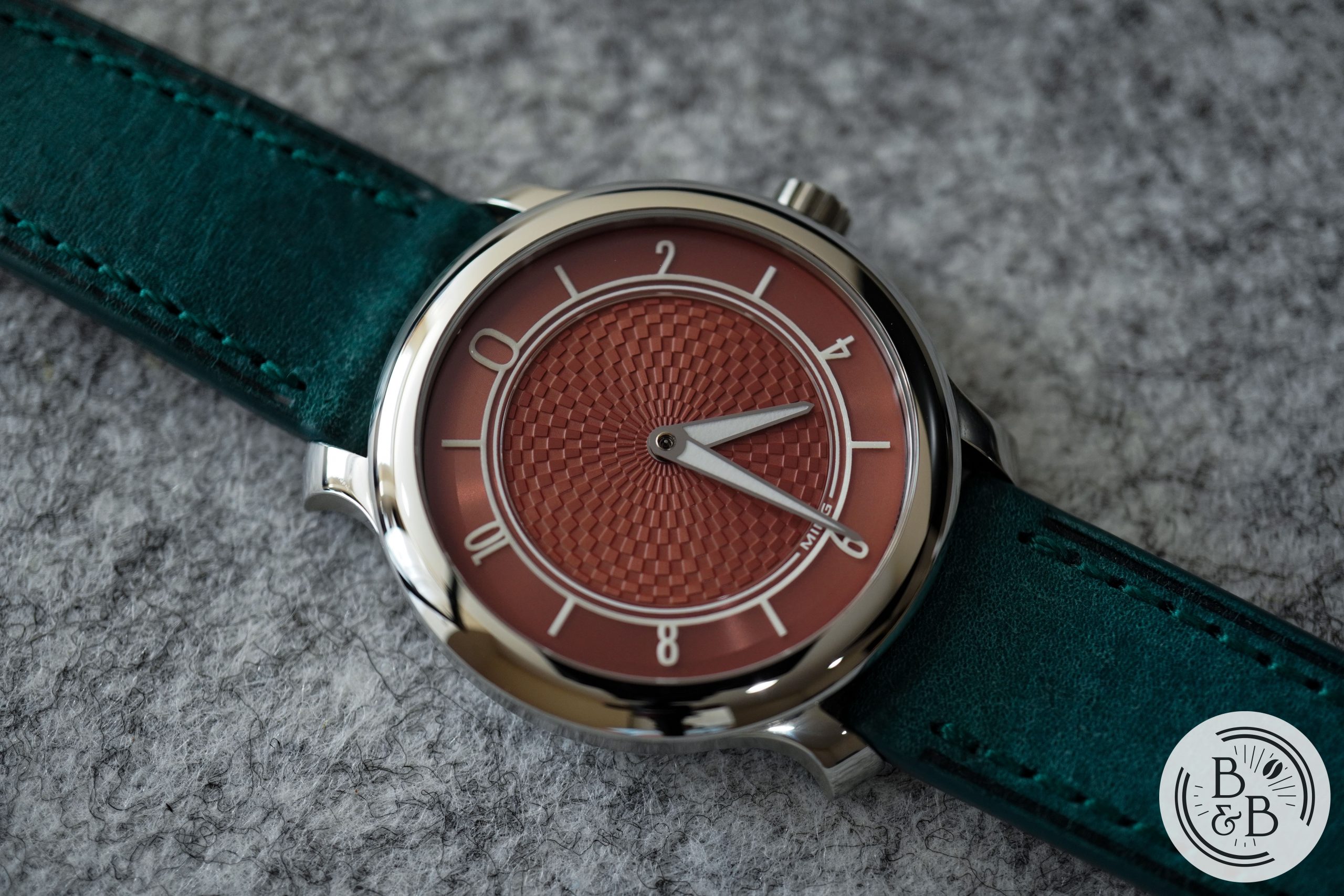
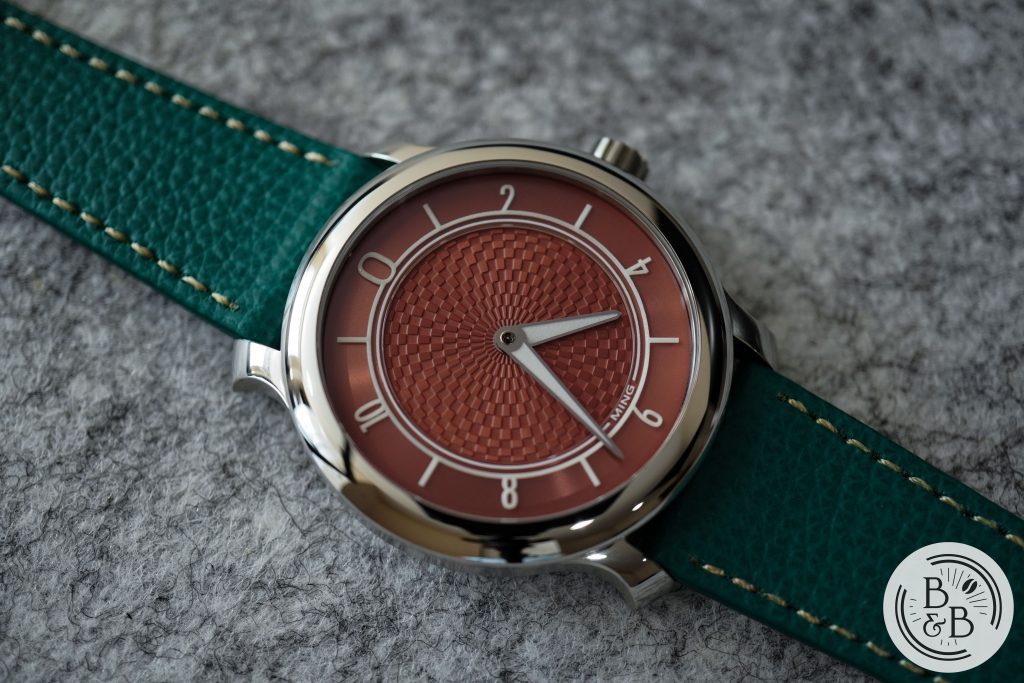
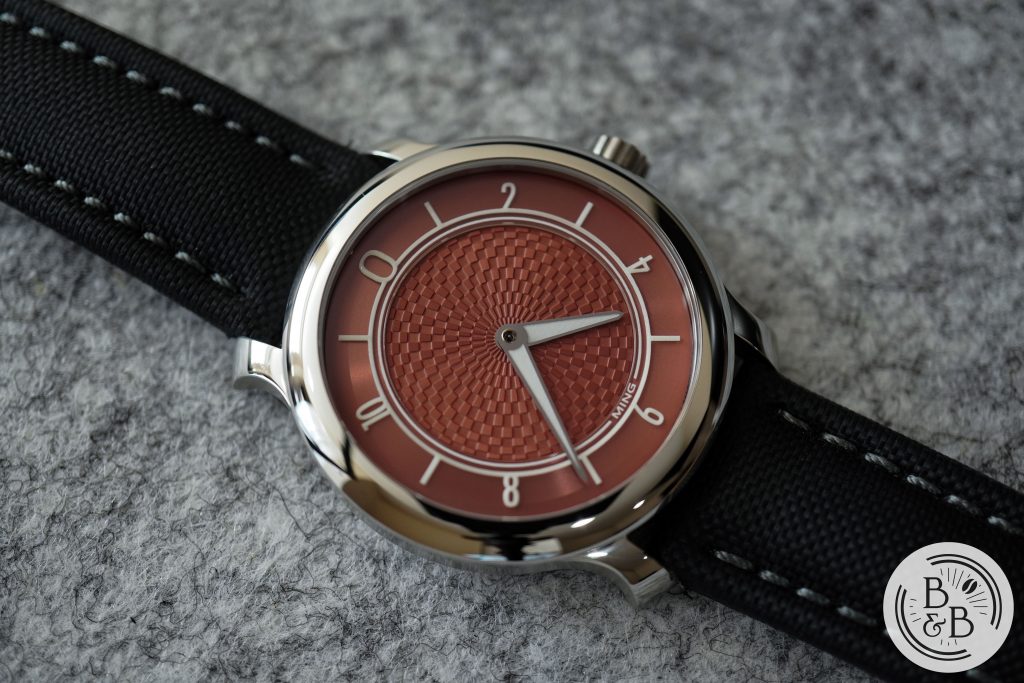
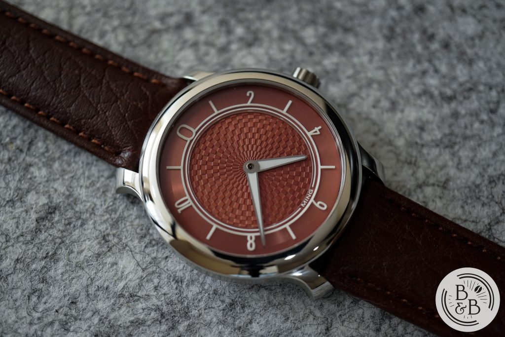
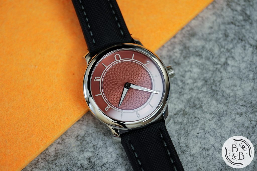
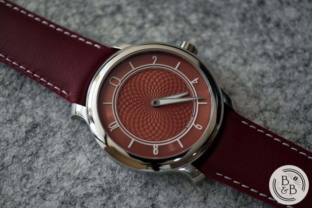
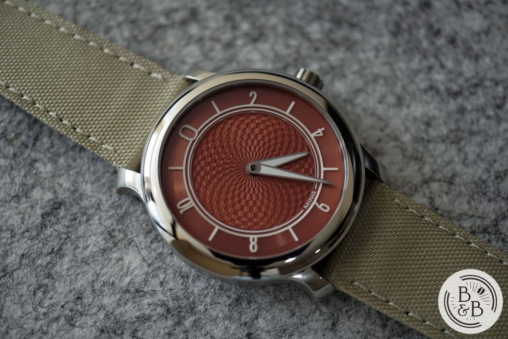
The 17.06 was released in a blue slate dial and a copper dial. This dial has more pink and red hues than typical copper, but I think copper is an accurate enough name for the dial color. I know the salmon dial loving crowd have openly welcomed this watch as one of their own, but it seems like anything passes off as a salmon dial these days.
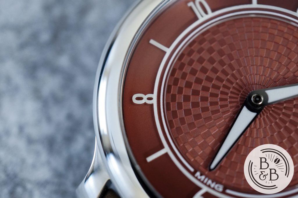
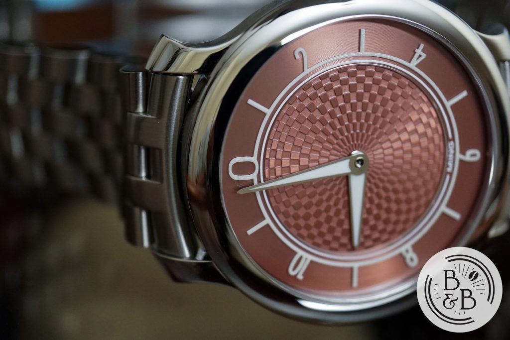
The outer ring is circularly brushed with fine grains or ridges, above which sits a sleek sapphire plate. The numerals are painted or printed onto the plate, and this results in a beautiful shadow being cast onto the metallic surface below. The quality of printing is good, and I love the alternating use of Arabic numerals and white ticks, and prefer this to the all Arabic dial of the 17.01.
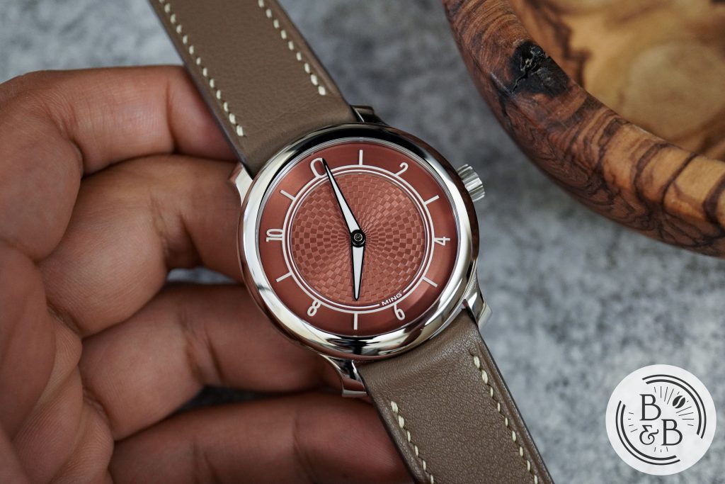
From certain angles, you see a small notch above the 12 o’clock marker and below the 6 o’clock marker. I couldn’t figure out what this is, but it is perhaps a reflection of the two grooves of the sapphire plate from beyond the visible dial section. You don’t see it when looking at the dial head on, but only as you view it diagonally. I’ll be scratching my head over this for a while…
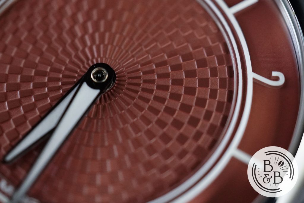
Moving inward, you have a beautiful pattern in the center of the dial, which combines raised polished elements and recessed brushed ones that emanate radially from the center of the dial. I love this texture on the 17.06 watches, and I like that it is a lot more prominent than the one on the 17.01.
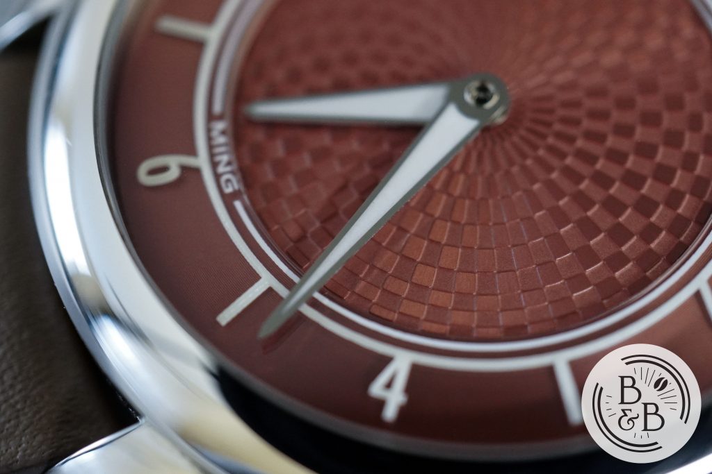
The 17.06 got a completely new set of hands, with a polished steel frame and large lume filled sections. I like this a more than the entirely painted 17.01 hands, and I think it just looks much neater here. The finishing on the hands is great and the proportions are excellent too.
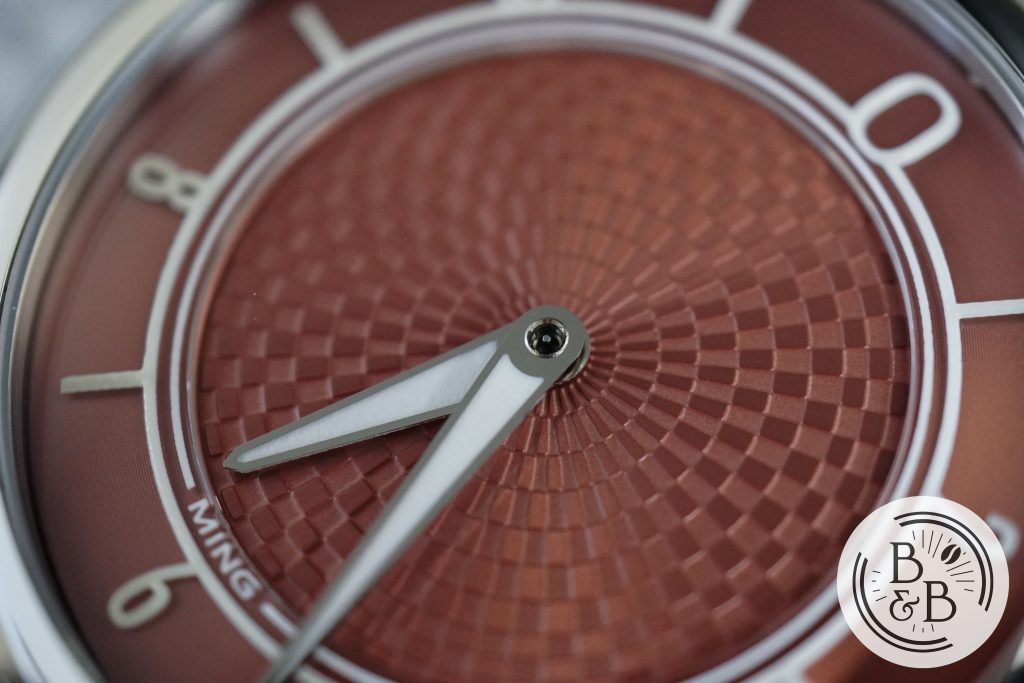
The pinion is exposed revealing the stem of the missing seconds hand. I’m usually not a fan of this and prefer it to be capped, but I think it somehow works here. I think a polished capped pinion would draw too much attention to itself, and would take away from the rest of the dial. The exposed seconds stem feel like a focus of expansion point for the dial pattern, and I kinda dig it.
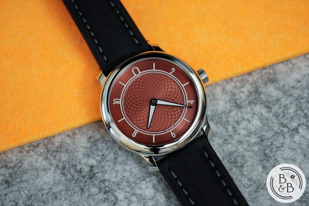
Overall, this dial looks stunning. I found it difficult to capture the exact color, and I think most people have similar issues, since no photograph or video I’ve seen of this watch prepared me for seeing it in person. It is very dynamic, and also “inverts” based on perspective and lighting. Great stuff here.
Lume
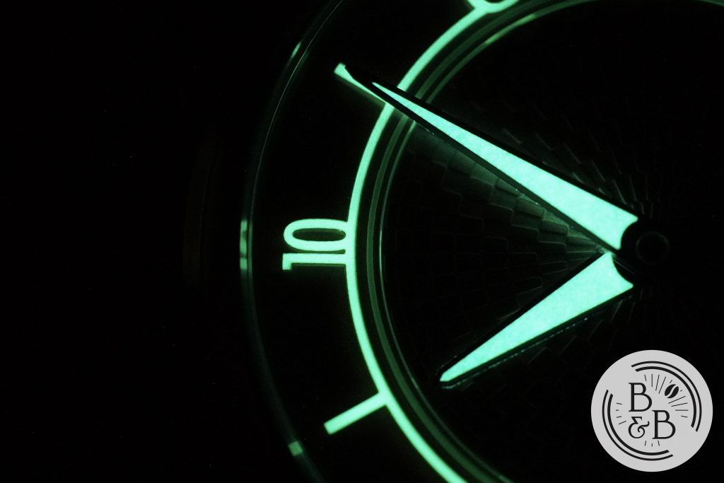
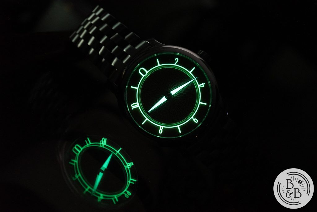
When I reviewed it’s predecessor, the 17.01, my only real criticism was the slightly underwhelming lume on the hands. The design of the hands meant that only a few layers of lume were applied on a solid hand structure, and that resulted in a grainy and weak appearance.
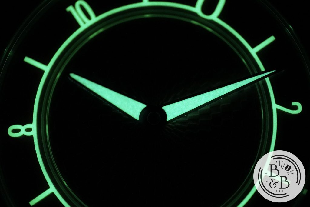
But MING changed up the hands for this watch, using a steel frame with large lume filled sections. I think this is a huge improvement on the design as well as for the low light legibility. The rest of the lumed elements have stayed pretty much the same, and fades a bit quickly, but the hands glow much brighter and hold their charge reasonably well.
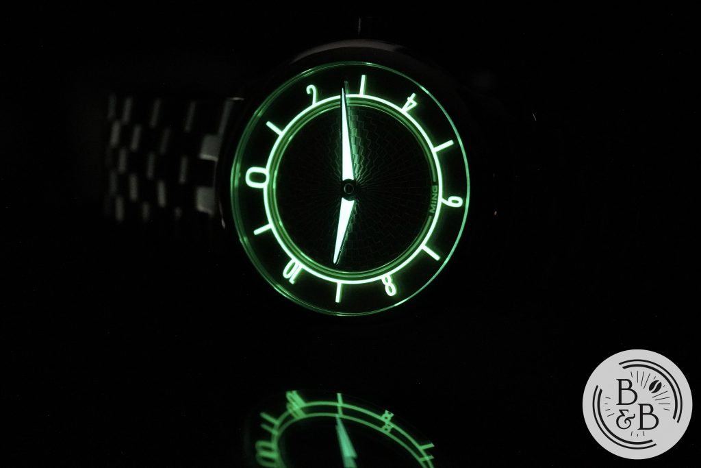
Breathtaking low light legibility wasn’t the purpose of this watch, and I think they flexed those muscles with their 18.01 diver. Here the lume is mostly for design, but is still moderately legible through the night because of the hands.
Movement
This watch uses an ETA 2824-2 top grade movement. The movement is slightly modified to remove the ghost date position, which is great. I’m not very forgiving of watches over $500 that leave that in there, and to my surprise, there are a lot of them..
There’s not much to say about this movement. It is a tried and tested, easily serviced, easily replaced, reliable movement that keeps good time. At $1350, and given where their budget was focused, I think this is an excellent choice and I have no complaints.
On my time grapher, I observed roughly +4 spd in the dial up position and +6 spd in the crown up position. I’m perfectly happy with these numbers and I think they did a good job here.
Bracelet
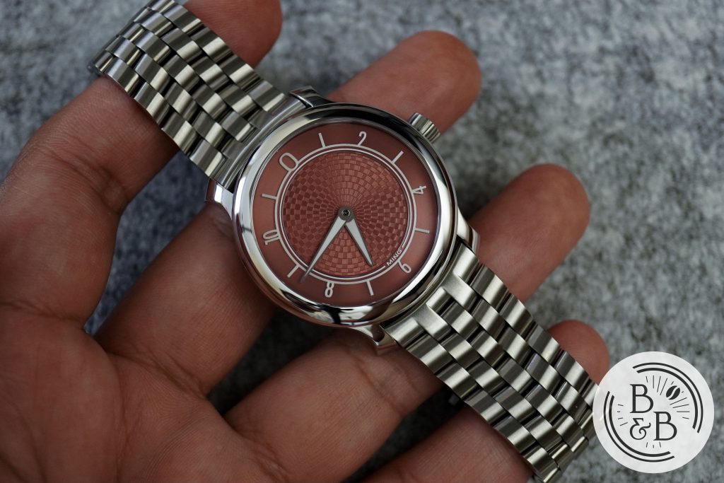
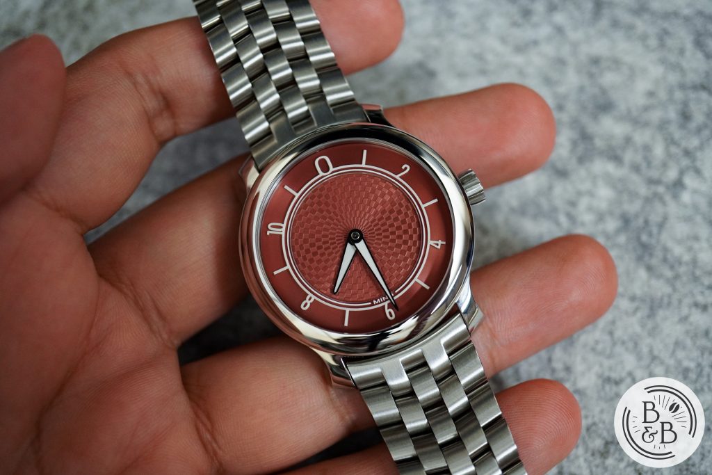
This watch did not ship with a bracelet, but their Universal Bracelet looks fantastic on this watch. I reviewed this bracelet in detail in my review of the 18.01 diver, so I won’t revisit that here, but I think that the bracelet works better on their more dressier pieces than it did on their diver. I haven’t been able to take this off since I put it on this watch. Excellent build quality, finishing and comfort. No on-the-go adjustment, but for a dressier watch, I think that is reasonable.
On The Wrist
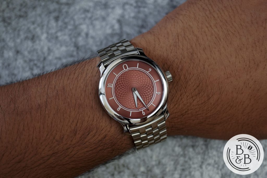
This watch wears nearly identically to the 17.01, and that’s because the case is the same, with a diameter of 38 mm and a lug-to-lug width of 44 mm. These proportions wear well on my 6.5″ wrist and suit the dressy sports watch aesthetic well.
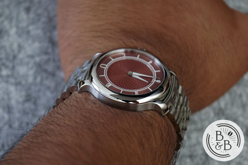
The height has increased from around 9.5mm on the 17.01 to 10.1 mm on the 17.06, because of the transition from a hand-wound Sellita SW210-1 to an ETA 2824-2 movement. The difference is practically negligible, since that height just adds a bit more curvature to the curved case-back.
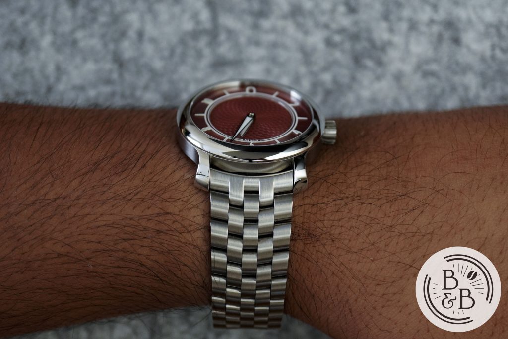
I love how this watch wears on my wrist, and I have no complaints whatsoever. I’ve noticed that it tends to look smaller and more dressy when on a leather strap, and looks bigger on the metal bracelet.
Concluding Thoughts
So to wrap this up – I love this watch. At the original retail price of $1350, I think you got an incredible watch. You got a unique color, a unique dial design, a unique case with excellent finishing, and an overall package that just feels like quality. Unfortunately, as these prices start to blast off into the stratosphere, the actual watch remains the same. So whatever price this watch ends up at, I’ll just say it’s a very, very good watch for $1350, and I’m happy paying the hefty premium to be able to experience it and own it. I believe that separating it’s retail price from it’s premium is a more practical approach, and avoids disappointment while also grounding the actual product in reality, with some sense of objective reasoning behind it’s original price.
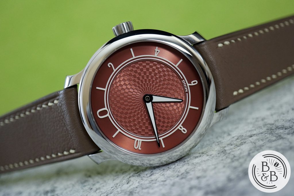
If you feel as passionately about these watches and MING watches in general, don’t pass on an opportunity to check out a 17.06. I think it’s a great improvement over the 17.01, and one that I believe won’t be eclipsed by the upcoming 17.09 release either. But more on that in a few months…
Strap Change
Thanks for reading!

