Disclaimer: These watches were sent to me to review, and I was not incentivized in any way to write this. This is in no way sponsored by Batavi or any other entity. All opinions here are my own. Since these watches were worn/used by other reviewers, please make note that the experience might differ from that of a brand new watch.
Contents
Intro
Batavi is not new player in the micro-brand universe, and they’ve made a good name for themselves over the last year with their Kosmopoliet GMT watch. The Kosmopoliet was a success on Kickstarter with over 100 backers bringing in close to $90,000. I believe that all these watches have been delivered to backers, and the feedback so far looks good!
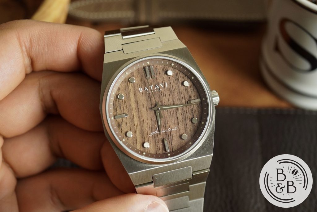
This is their next project, called the Architect series, which features a Gerald Genta style case and integrated bracelet design that screams 70s watch design, with a set of three architecture inspired dials. I’m glad I was sent the walnut wood dial as I’m a huge fan of walnut wood grain in general, but the other two dial options are interesting too.
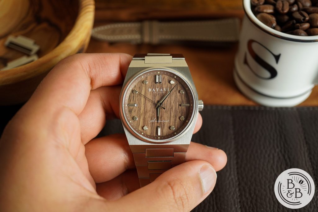
This watch is said to go on Kickstarter soon, and will have a Kickstarter price of around $420 USD.
Let’s check it out!
Case
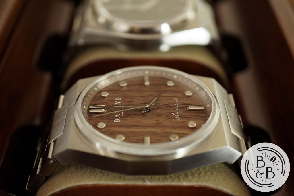
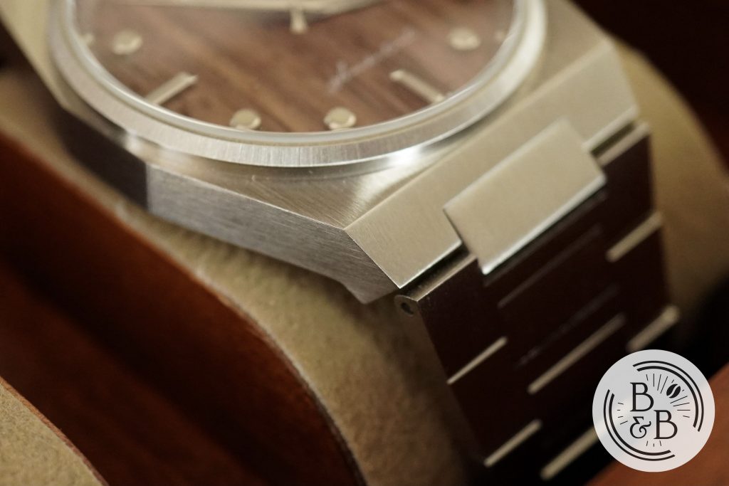
I measured the case to be 39 mm in diameter (from 3 o’clock to 9 o’clock), 46.5 mm from lug-to-lug (50.75 mm if you consider the fixed center link section), and 10.85 mm in height. The case is primarily brushed, and the quality of brushing is pretty great.
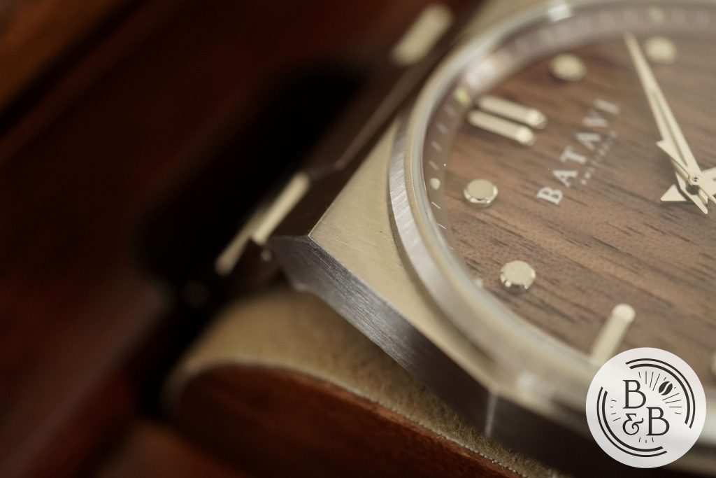
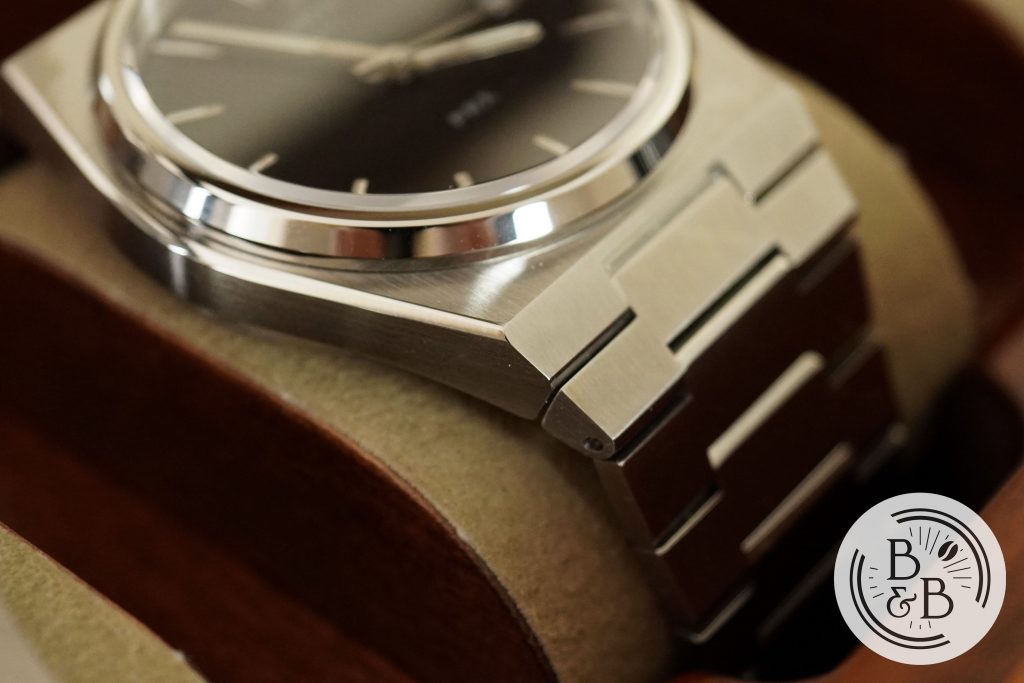
The only complaint I have with this watch is that this case does the 1970s sharp angular design a little too well. The corners are razor sharp and can almost be weaponized.
In this area, I prefer what Tissot did with their PRX cases, by introducing some polished bevels and rounding off some of the corners. But to give credit where due, the Tissot case finishing is a few steps below the Architect.
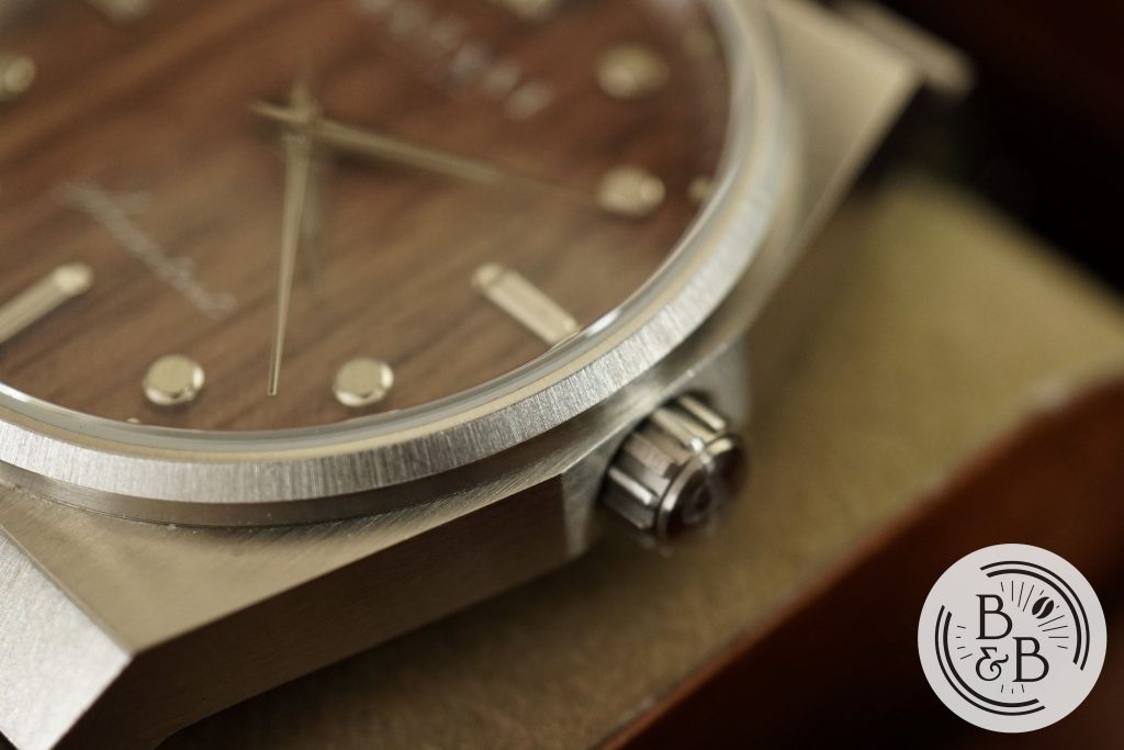
You then have a beautiful brushed fixed bezel section that seats a flat sapphire crystal with AR coating. I didn’t have any trouble with reflections on this one, and I love the sleek bezel and crystal construction.
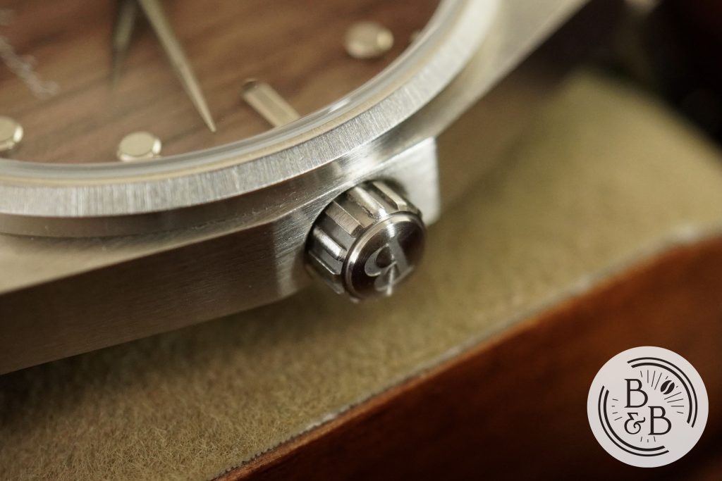
There is a small 5 mm screw-down crown at the 3 o’clock position, but it makes up for it’s small size with excellent grip. There isn’t any crown or stem wobble here and the crown is also signed.
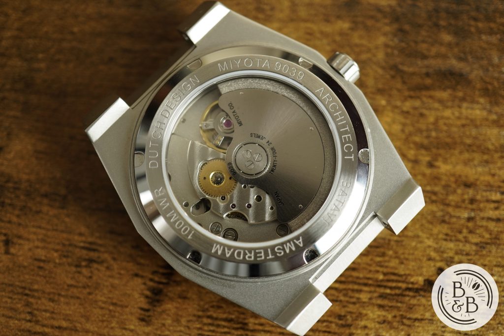
Flipping it over you have a screw-down case-back with an exhibition window. This watch is rated for up-to 100m of water resistance.
Dial
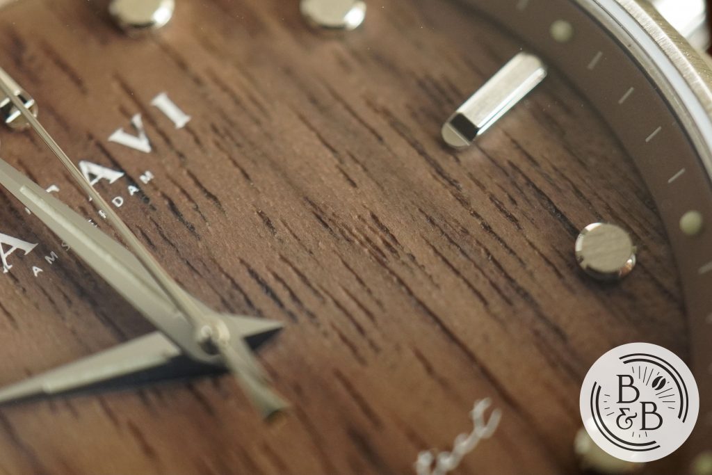
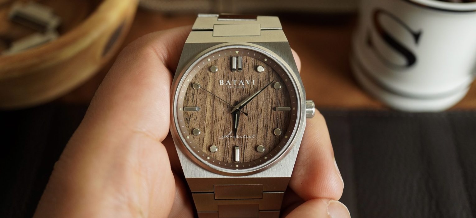
This is the wooden dial option, and features a beautiful Walnut wood grain. I believe this is real wood and not a printed pattern. The grain looks lovely, and I’m curious to see the variations across different dials when it goes into production.
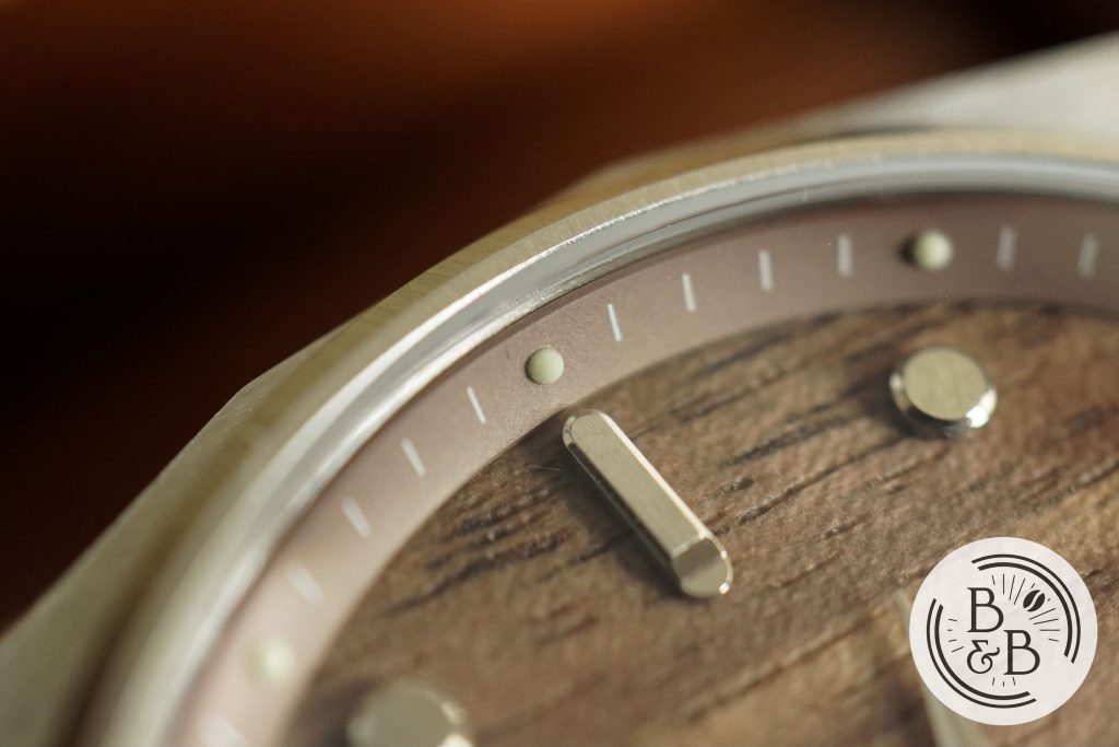
There is a sloped brown chapter ring that has lumed circular pips for each hour index, and small white ticks the rest of the minute markers. This track matches the dial well, and is easy to read. The printing and finishing quality is very good.
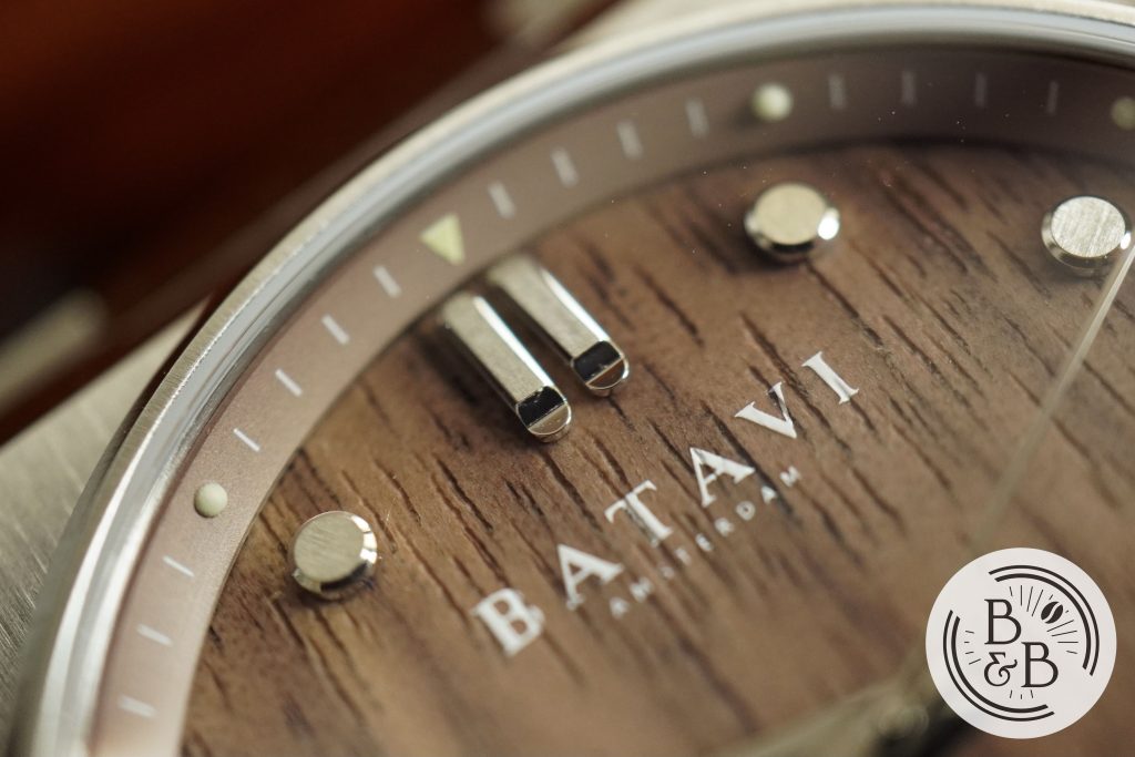
You then have applied stainless steel hour markers that have brushed top surfaces and polished sides. The four main axes have baton style markers, with double markers at the 12 o’clock position. These double markers look slightly misaligned in these photographs, but it looks fine in person. I don’t know what’s going on.
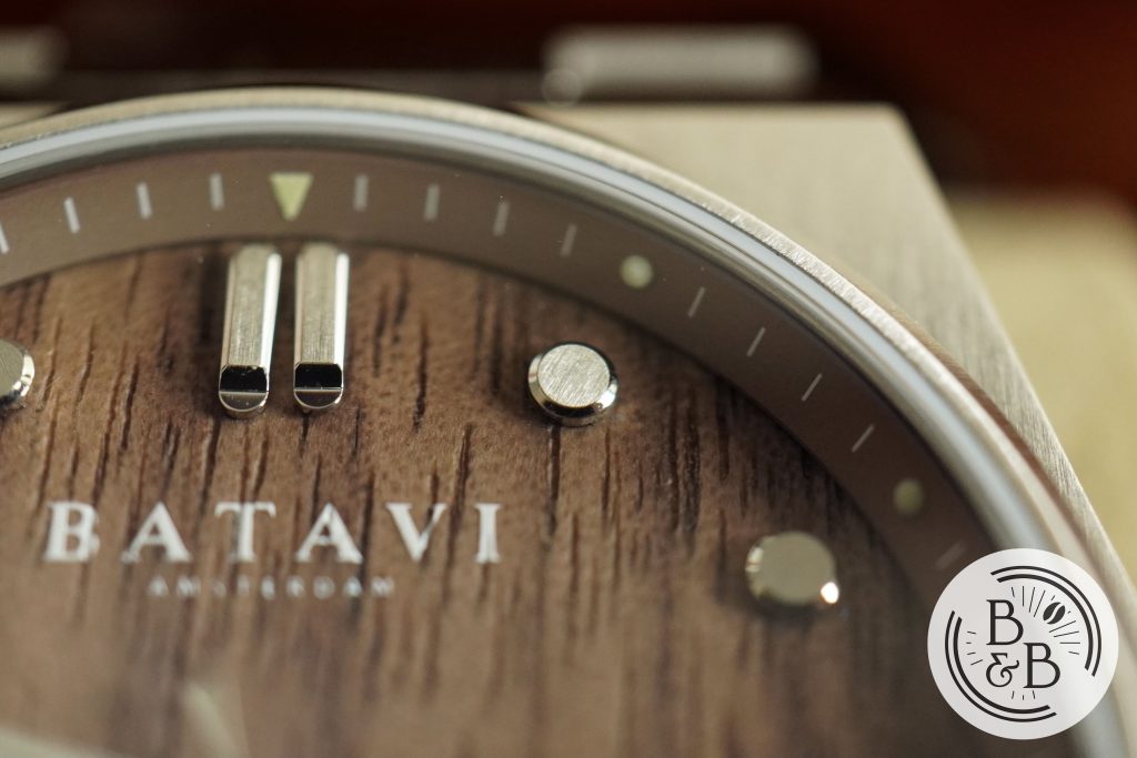
The rest of the markers are circular button styled indices and the finishing across all of them is quite impressive for the money. There was a strand of a fiber stuck to one index, but this is a prototype so I suspect the quality control will be better on the production units. The rest of the indices and dial is pretty clean, to be fair.
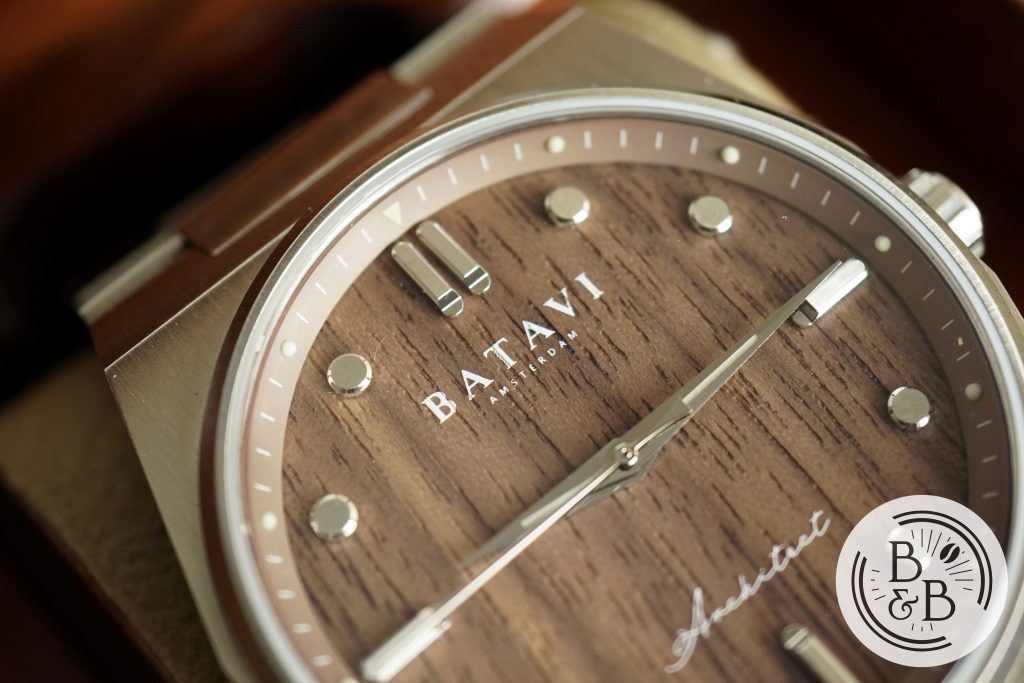
The brand’s name is printed under the 12 o’clock, and Architect above the 6 o’clock. I love that this is printed onto the uneven wooden grain, and the printing quality is pretty good.
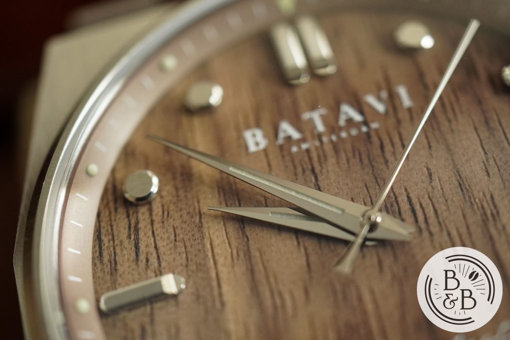
You then have a very sleek handset that I think suits this watch quite well. The hour and minute hands have good lengths and contain lumed elements. I think slightly thicker hands would’ve improved legibility, but I think this is fine. The seconds hand almost reaches the outer track, and is easy to read.
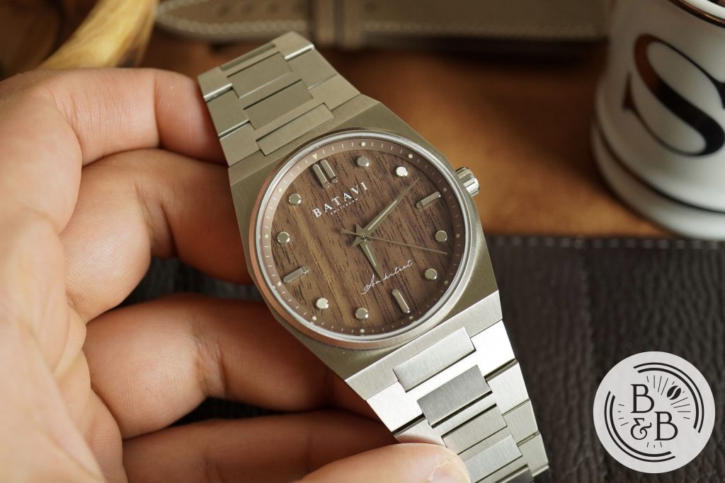
Overall, I think the dial looks great and under normal lighting conditions this watch is easy to read and looks quite impressive. The applied indices are quite reflective and look great under natural light too.
Lume
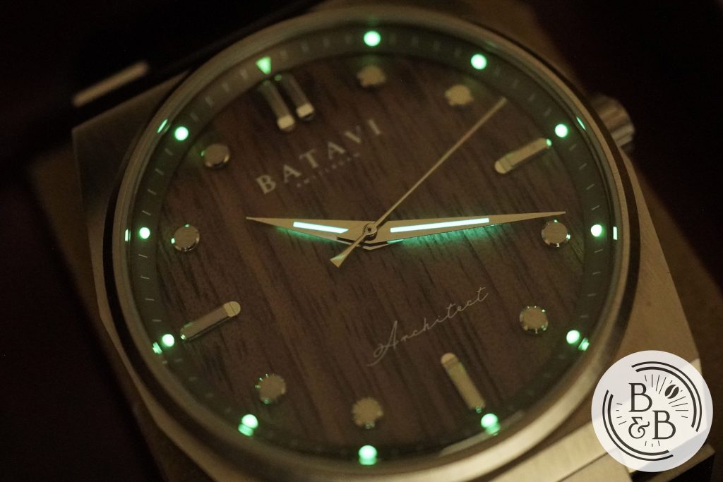
This is definitely more of a dress watch than a sports watch, but they’ve done a good job adding some practical everyday features too, like a screw-down crown and a limited, but useful, lume layout.
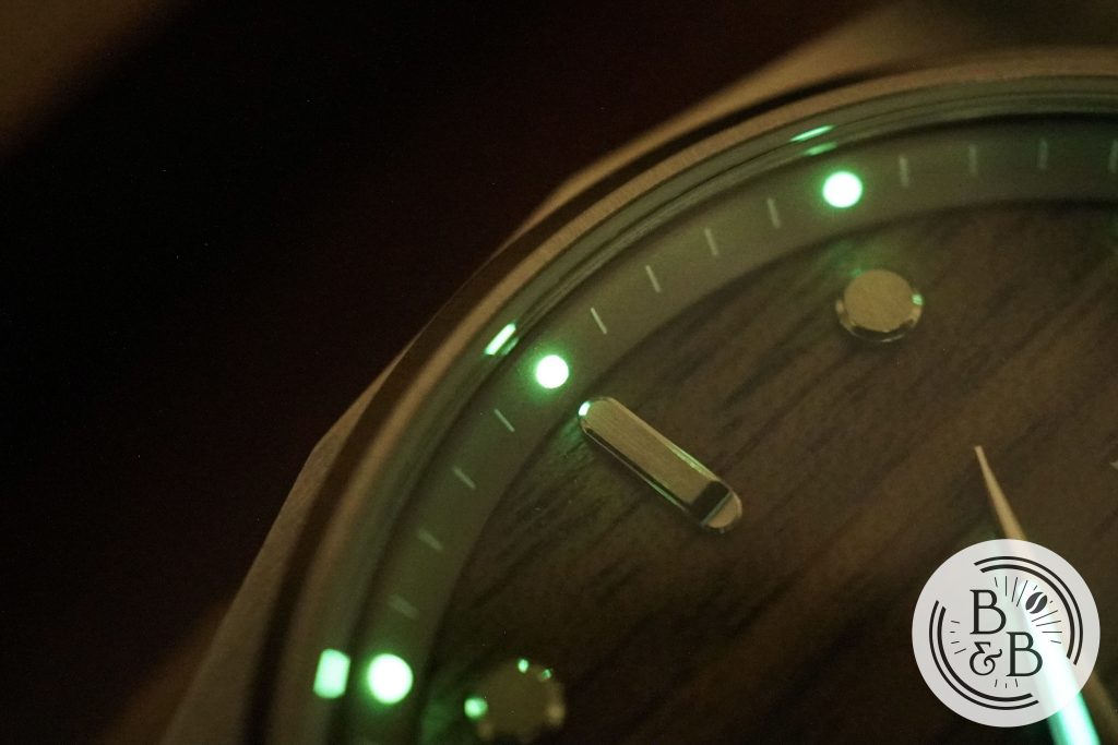
All the hour marker pips on the chapter ring are lumed, and they’re good enough for telling the time in a poorly lit room or a quick transition from bright to dark.
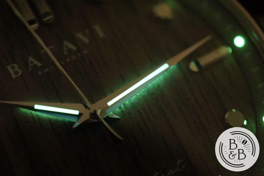
The hour and minute hands also have lumed strips that are reasonably bright. Overall this is a good attempt at adding lume to a watch that could get away without it entirely.
Movement

Given this case size, and the height in particular, it is no surprise that they used a Miyota 9039 movement. This is a reasonable movement for the $420 price tag and is pretty good overall.
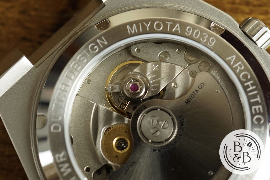
The typical rotor noise and wobble is minimized by the hefty build, and the sapphire crystal case-back gives you a glimpse of the modest finishing and lackluster rotor. It appears reasonably clean too, indicating good quality control.
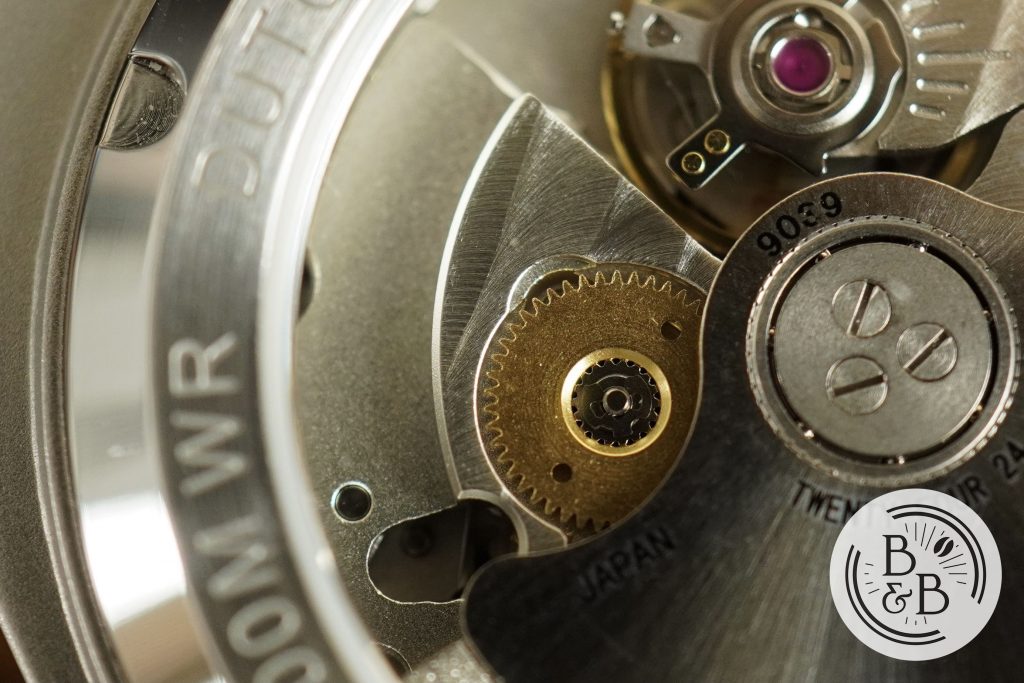
On my time grapher, I observed roughly -3 spd in the dial up position and +1 spd in the crown up position. Reasonable numbers for this movement and a watch in this price category.
Bracelet
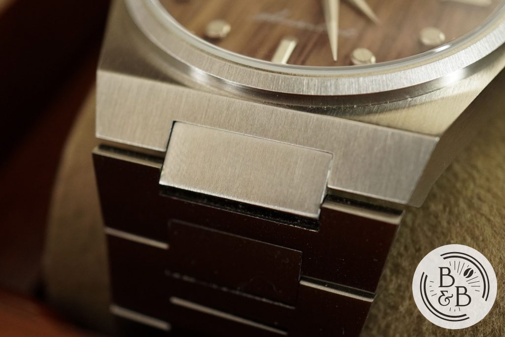
The bracelet is good, but has a few sharp corners and edges just like the case. You don’t feel any of these on the wrist, so it’s not really a problem, but if you run your hand over the watch you’re going to definitely feel all those ninety degree angles.
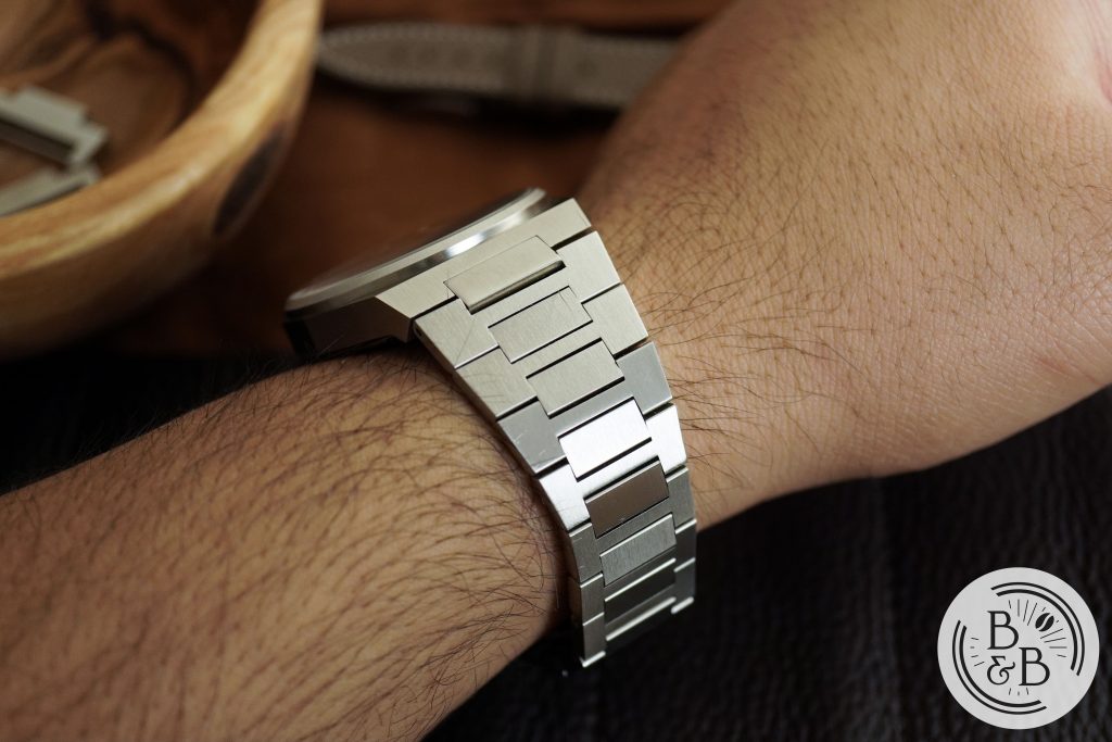
The case attaches to the bracelet by means of a center link that does not articulate. This effectively increases the lug to lug width to 50.8 mm, but this didn’t really impact comfort in anyway for me.
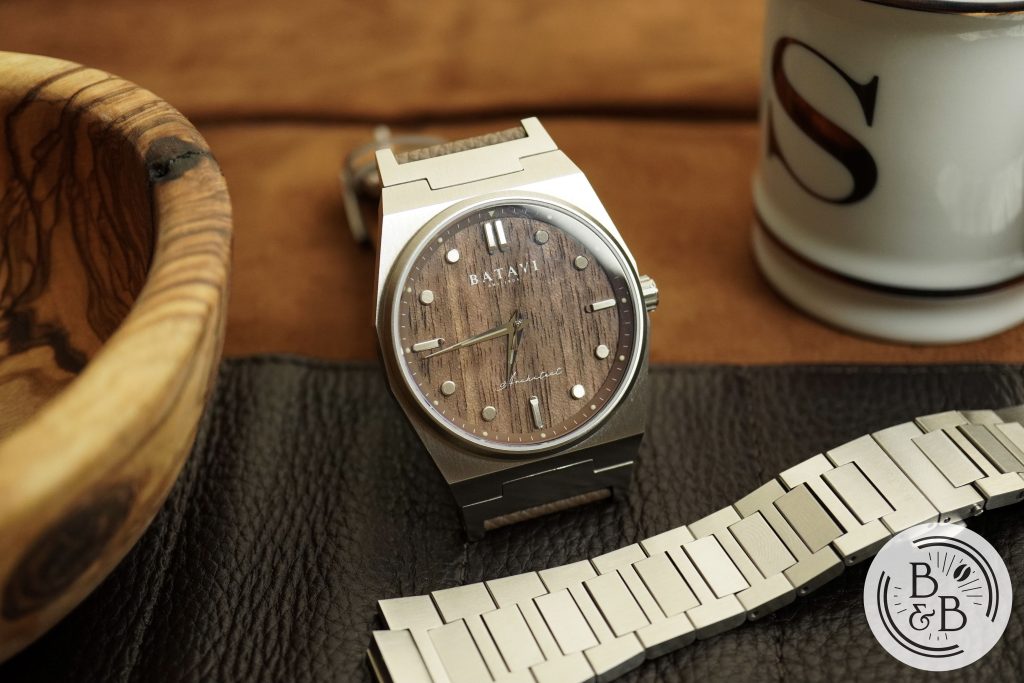
The links are otherwise well finished with the same excellent brushing. The bracelet wears about as comfortably as any other modern integrated bracelet watch. There is a butterfly style clasp and no half links that I could find included in the package. I was able to dial in a reasonably good fit though.
On The Wrist
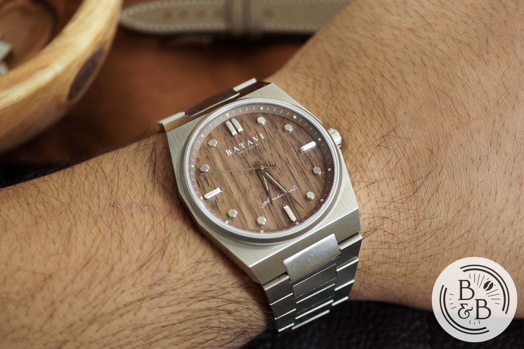
The 39 mm diameter case (measured from 3 o’clock to 9 o’clock), and the 46.5 mm lug-to-lug width wear surprisingly well on my modest 6.25″ wrist. I wasn’t expecting it to wear this nicely, but it does.
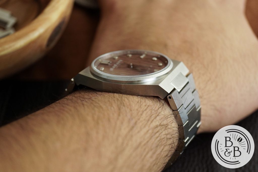
I suppose this has to do with the 10.8 mm slim case height and flat case-back. I think it has a great wrist presence and this dial in particular looks amazing on my wrist.
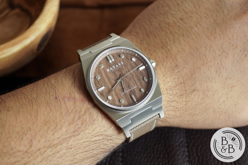
You can swap out the bracelet for their strap adapter, which are a pair of fixed end links that can be attached to any 20mm strap. While this is a great idea, it makes the watch a bit too large for my wrists since the link adapters do not articulate, and this increases the effective lug-to-lug width by 6mm. So if you have small and medium sized wrists, be prepared for a big change in wrist presence on strap.
Concluding Thoughts
Overall, this is an easy watch for me to recommend given the price tag. At $420, that’s about $50 more than the Tissot PRX quartz. And while the Architect isn’t perfect with it’s somewhat sharp edges, it makes up for it and more with it’s stunning dial, very good finishing, and an overall great looking design.
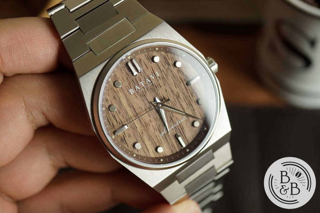
So if you’ve been wanting a Gerald Genta style watch but dislike all the more blatant copies out there, this is a great option. You get to experience the dramatic angles and straight line design in a package that is creative and interesting. I also just enjoy looking at the beautiful grain on the wooden dial, so that’s a good enough reason to get one, in my opinion.
Thanks for reading!

