Disclaimer: This watch was sent to me to review, and I do not need to return it after my review is complete. This watch was given to me without restriction and is not contingent upon a particular outcome for my review. All opinions here are my own, and Dumoreau had no influence over the opinions stated here.
Contents
Dumoreau
Dumoreau is a new microbrand founded by Carlo Aiello, a product designer and architect from California. The DM01 is the brand’s first watch, and is an integrated bracelet stainless steel sports watch that isn’t hiding where it draws its influence from, but is also a tasteful and well designed homage to the works of Gerald Genta. There are a lot of neat details and design elements in this watch that indicate Carlo’s attention to detail, and the price of $395 USD makes it highly attractive for those looking for the Gerald Genta aesthetic on a budget. Before you pounce on this watch for being too close to Gerald Genta‘s designs, take a look at the Tissot PRX automatic and the dozen other “reputable” brands that are doing the same thing.
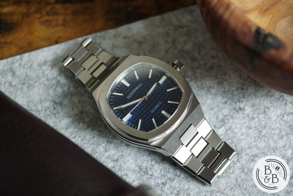
With that out of the way, I think this watch deserves a place on the list of affordable integrated bracelet sports watches in the sub $500 range, and is a strong contender against watches like the Batavi Architect and Tissot PRX.
Let’s check it out!
Case
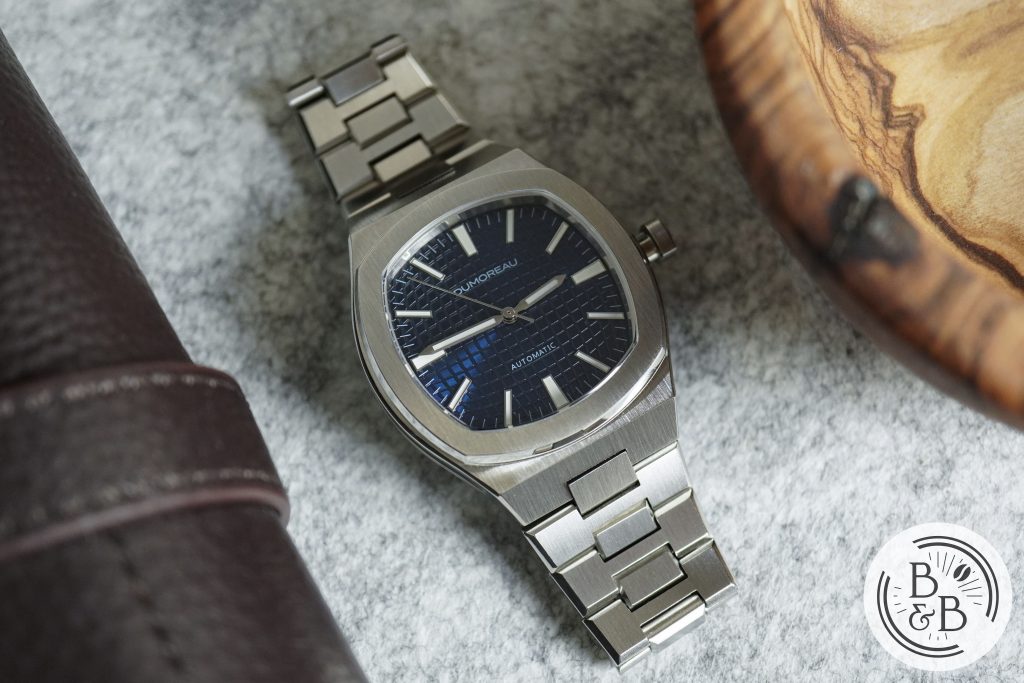
I measured the case to be 39.5 mm in diameter, 45.9 mm from lug-to-lug and a sleek 10.3 mm tall. The case is made entirely of stainless steel, with mostly brushed finishing and some neatly applied polished elements.
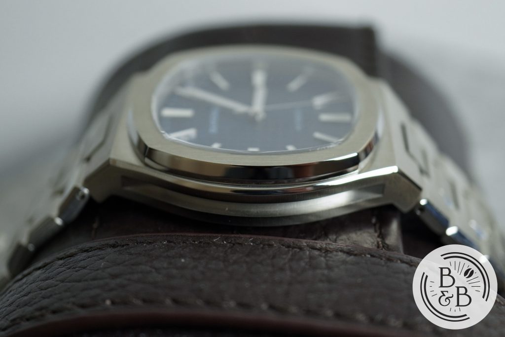
The case is going to look familiar because it resembles a bit of all the popular Gerald Genta watches, but isn’t a hideous amalgamation like the Genius Genta watches. Its got a bit of Audemars Piguet, a bit of Patek Philippe, a bit of Piaget and a few other designs sprinkled in there. I’m not going to pretend this is an all new design, but it is a well executed and affordable homage to an iconic watch designer.
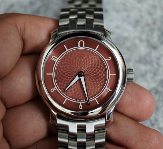
What I love most about the case is the hollowed out sides. I’m a sucker for hollowed case watches, and love this on my MING 27.01. You could say this has a bit of Czapek Antarctique influence in there, and I think it looks great, and makes the case feel even sleeker than it reads.
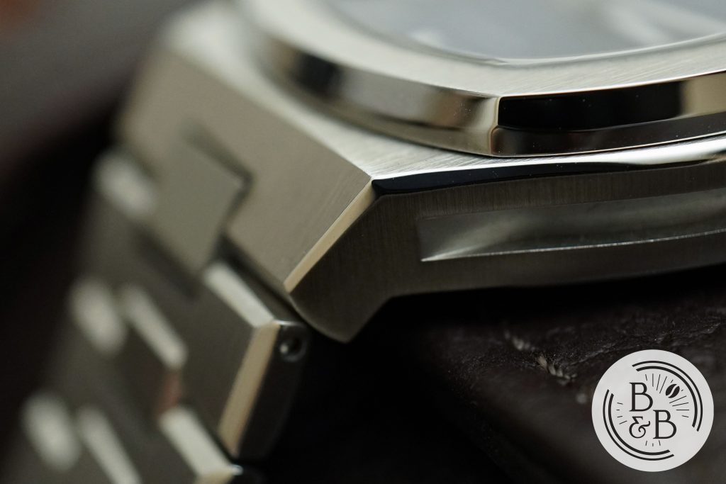
This is an integrated bracelet watch and lacks definitive lugs, but the slim mid-case dramatically angles down towards the wrist, and eventually continues into the bracelet via center link.
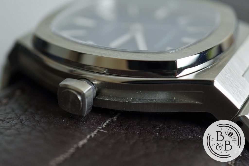
There is a fixed bezel section, with polished sides and a vertically brushed top surface. I think this looks good, and has a similar design aesthetic to the Nautilus. The brushing and polishing is good, and beyond what I’d expect from a $400 watch.
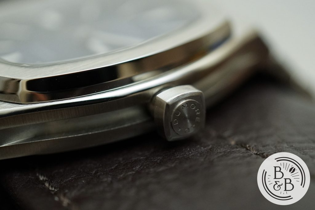
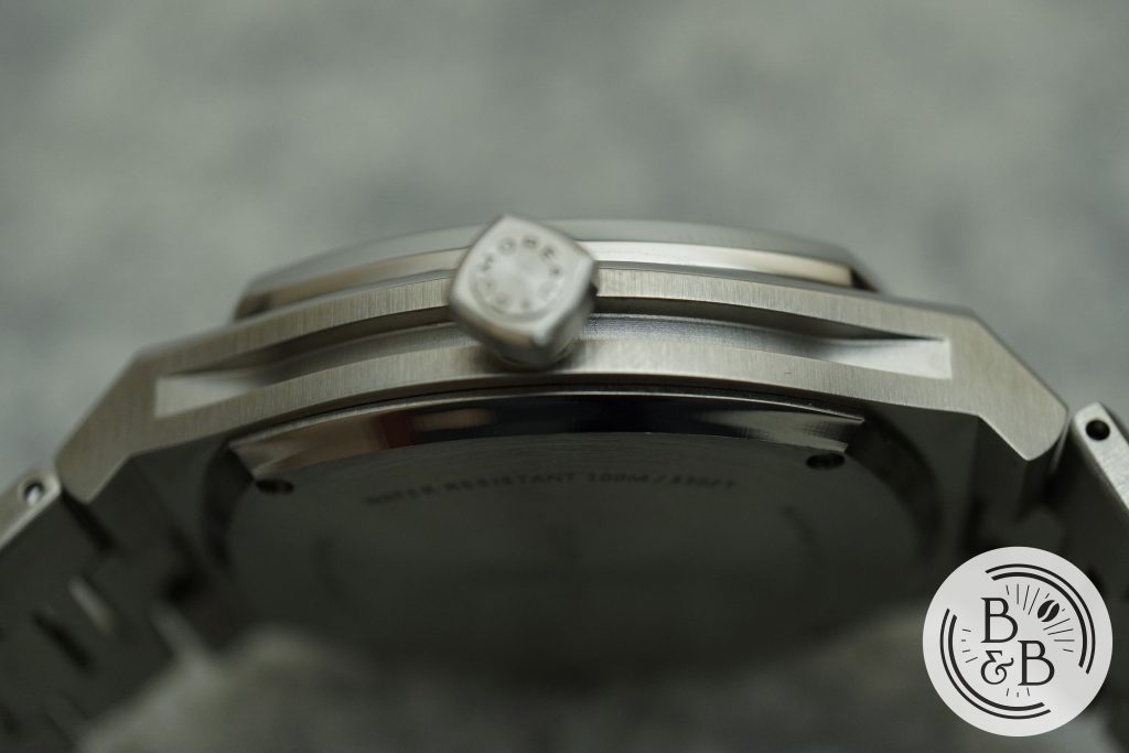
There is a 5 mm push-pull crown at the 3 o’clock position. The crown is a slightly rounded off square, and sits pretty high up from the rest of the case. My only real complaint with this watch is the design of the crown, which is a bit annoying to use since it is a square without much grip. It requires a lot more effort to wind, but thankfully this has an automatic movement.
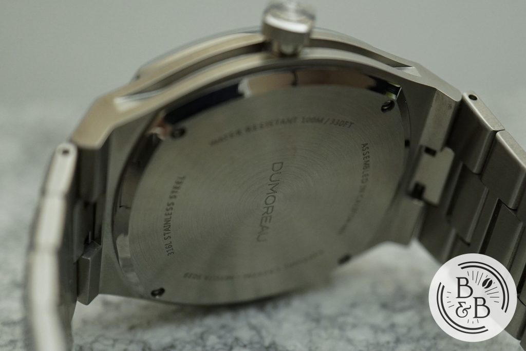
Flipping it over, you have a solid case-back that is attached to the case by means of four screws. This watch is rated for up-to 100m of water resistance.
Dial
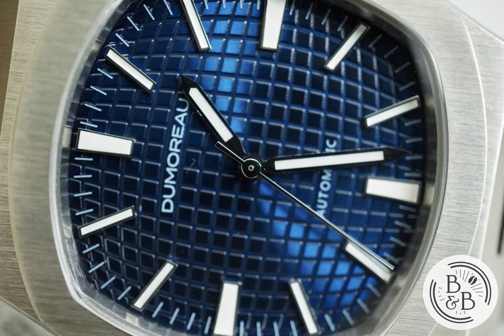
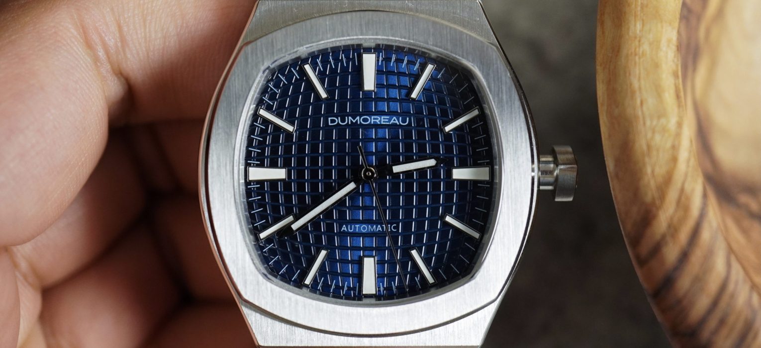
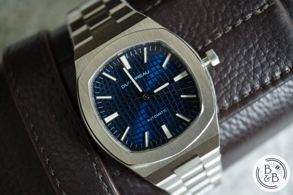
Like I already said, this watch isn’t trying to hide where it drew inspiration from. The dial also continues this idea of being very familiar but also just a bit different. The base of the dial is what you’ll find very familiar, since it has a pressed pattern that seems to have the radiating curved appearance of the Aquanaut with more closely packed textured elements like the Royal Oak‘s petite tapisserie. Except here all the raised elements are brushed with a sunburst finish.
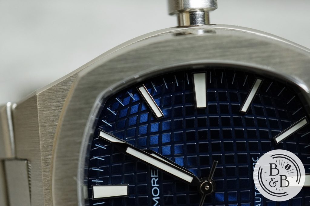
There is an outer minute track that is neatly printed on raised sections that serve as a base for these reference markings. The quality of printing is adequate, but I’m more impressed with the design. This is a great way to use the benefits of a machine pressed pattern over a more intricate engine turned guilloché.
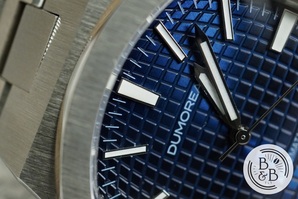
You then have applied stainless steel indices for all the hour markers, with slightly larger indices for the cardinal axes. These are generously filled with lume and are finished well for a watch of this price. The indices are not perfect rectangles, and the try to conform to the irregular shaped dial – another detail that I can appreciate.
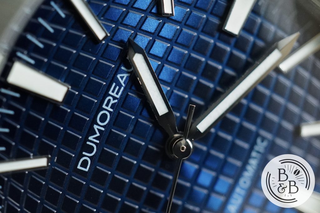
The brand’s name is printed below the 12 o’clock marker and ‘Automatic‘ above the 6 o’clock marker. The printing quality is decent, but the simple font and unobtrusive design is quite appealing.

The hand set is simple with polished surfaces and a generous amount of lume on both the hour and minute hands. The finishing is good and I think the simple design works well on this watch, and allows the dial texture to take center stage, along with the high contrast indices.
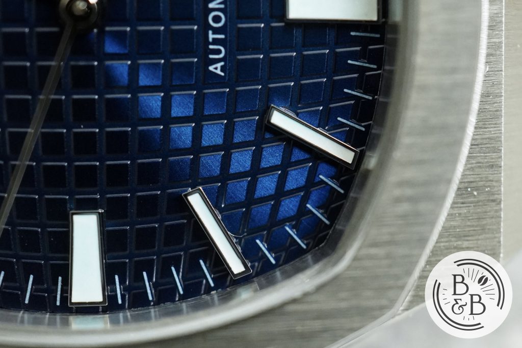
Overall, I like the dial design. You can say again it is an homage, and I will agree with you. But it is a design well executed, with wonderful symmetry and design elements that confirm that a good amount of thought went into making this.
Lume
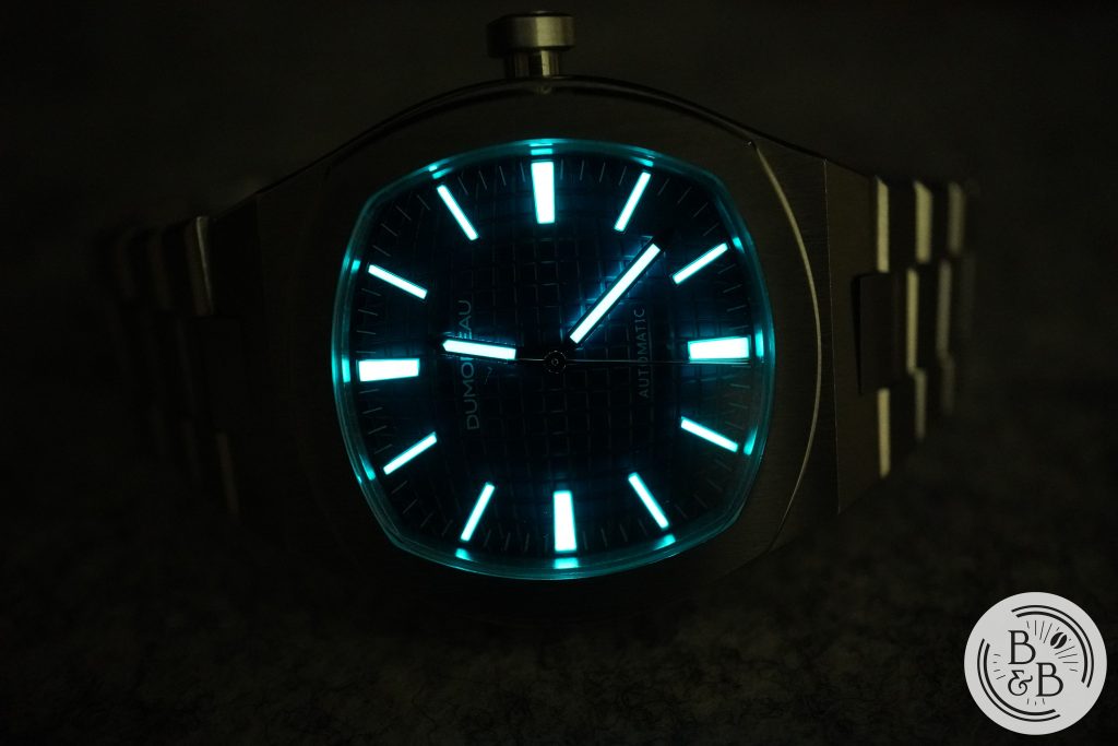
When you think integrated stainless steel sports watch, high performance lume isn’t the first thing that comes to mind, but this watch was a pleasant surprise. All the indices are lumed, and the dial layout symmetry gets another chance to shine here.
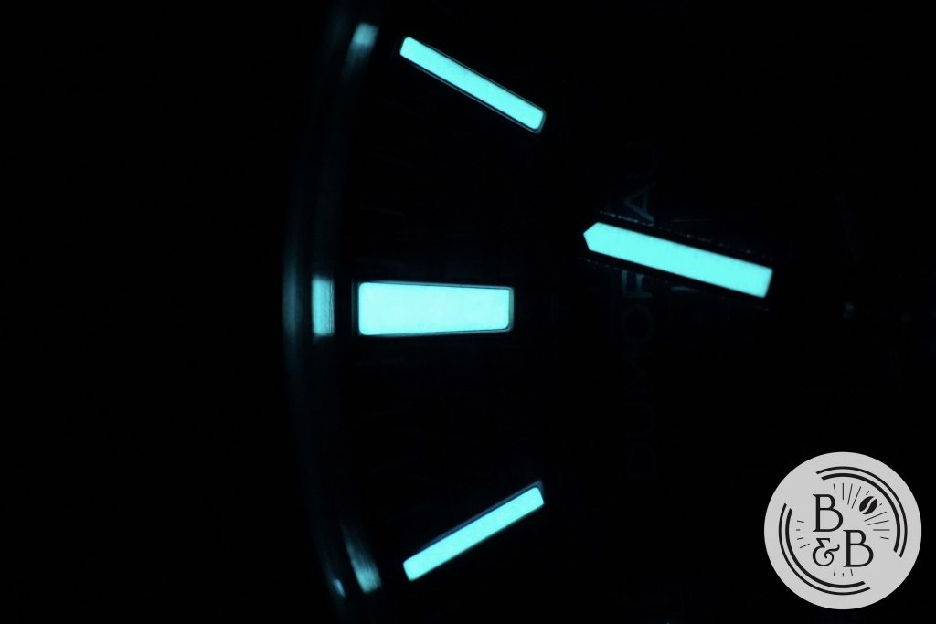
The indices are very generously lumed, glow bright and hold their charge well. I didn’t have a Seiko on hand at the time of this review, but I suspect this will hold up well against a Seiko or Zelos alternative in this price range.
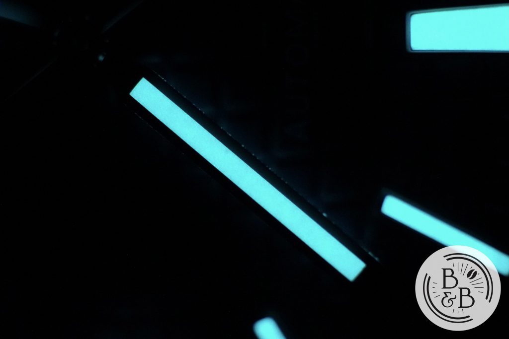
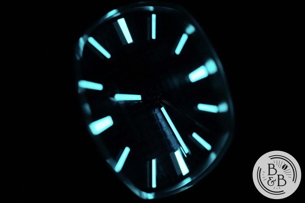
The hands are also well lumed, but the seconds hand does not have any lumed elements. I think for a watch like this, that is completely fine. A lumed seconds hand would make this a bit more utilitarian than is typically associated with the design genre.
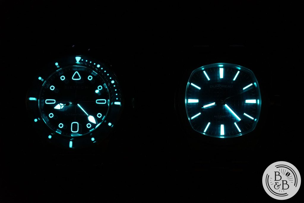
I compared it with the Dietrich SD1 Skin Diver, and it performed very well in comparison.
Movement
This watch uses a Miyota 9039 movement, and it is an excellent choice for a watch like this. It allows for the impressive 10.3 mm height, has a higher beat rate than a Seiko NH35 and is just a slightly better performing movement overall.
The only problem with these movements is the loud rotor noise, which seems to be a lot more muted on this watch. Perhaps the case construction and materials dampened the sound a bit, similar to some of Zelos’ watches with this movement.
On my time grapher, I observed roughly +4 spd in the dial up position and +7 spd in the crown up position, so good performance too!
Bracelet
The integrated bracelet design is pretty well executed. A lot of affordable watches, the Tissot PRX included, don’t fully get the bracelet right. The Tissot got all the finishing right, but the articulation wasn’t great at all, and the watch ends up wearing much larger than it needs to.
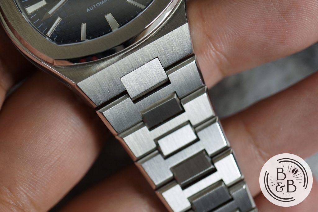
This bracelet has good articulation at the end links and they dramatically taper down from 22 mm to 15.5 mm at the clasp.
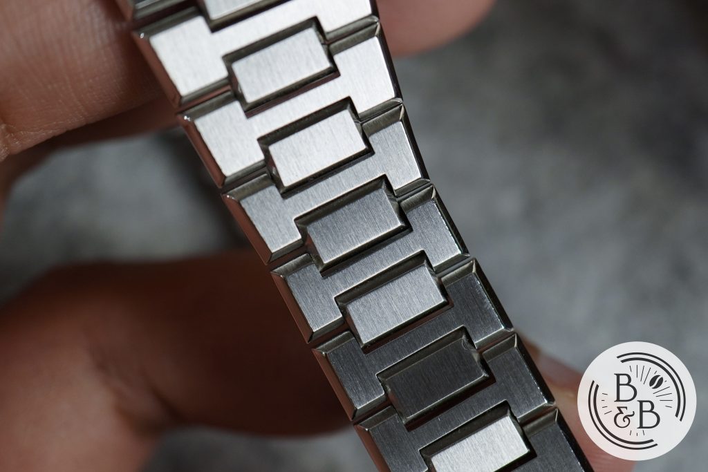
The links are reasonably well finished with smooth and polished edges. No sharp edges on this one like the Batavi Architect. They are attached via a screw based link system and are easy to adjust.
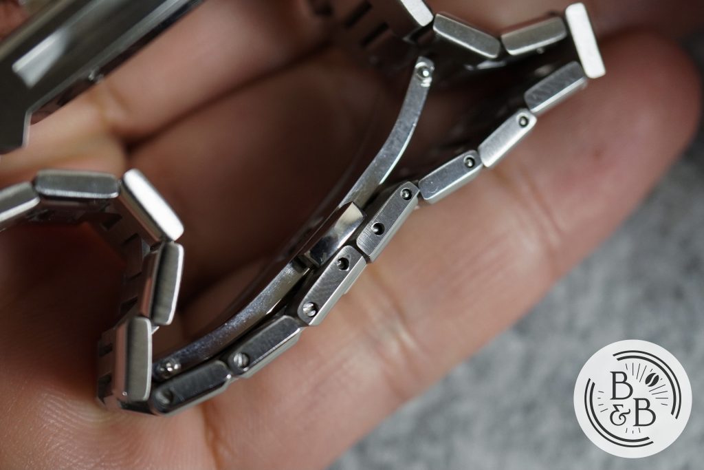
The clasp is a fairly standard butterfly clasp with a twin trigger release system, and the whole bracelet experience is quite comfortable. You get an extra 3/4th size link, but the standard link sizes were sufficient to get a good fit for me.
On The Wrist
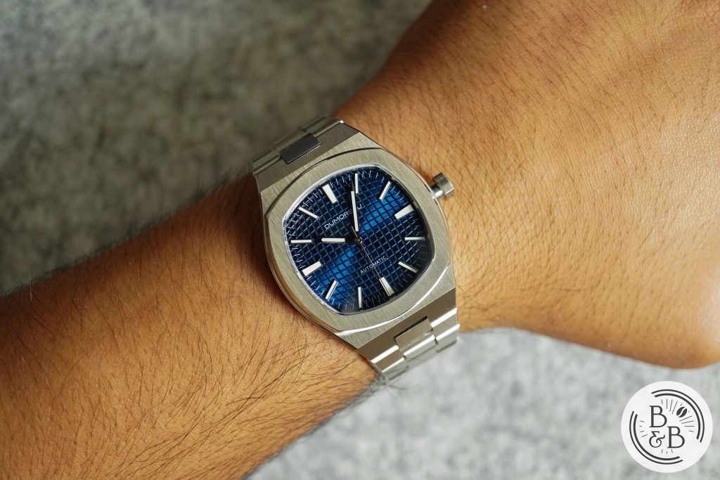
I’m not as crazy about the integrated bracelet stainless steel sports watch genre as the rest of the industry, except for a few like the Urban Jurgensen One, Moser Streamliner and the Rolex Oysterquartz, but each time I try one out I understand the appeal.
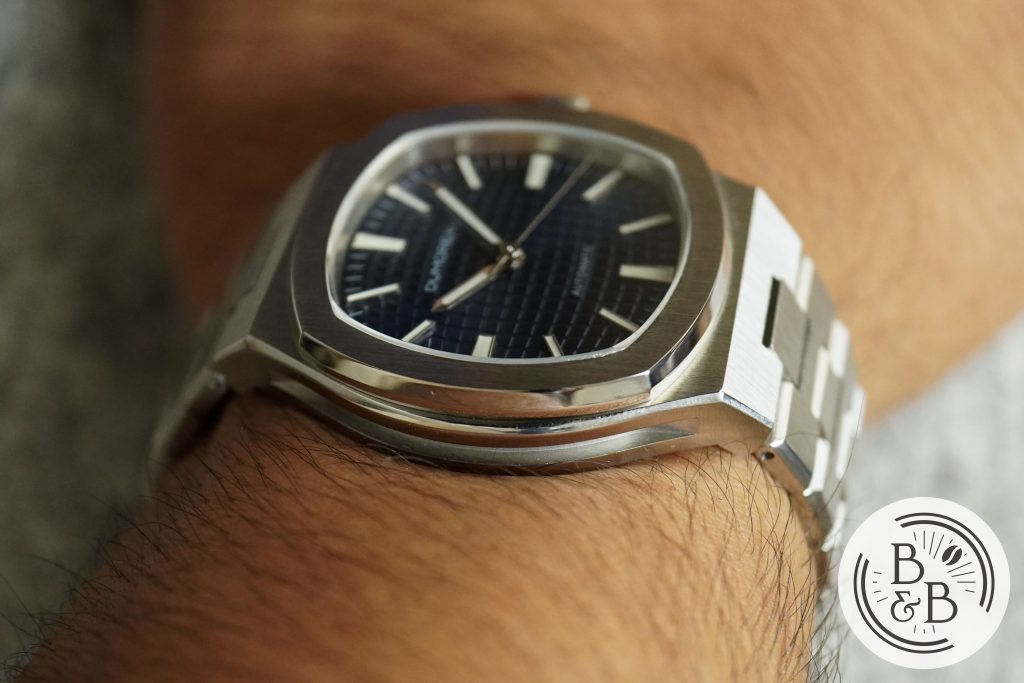
For a direct comparison, this watch wears so much nicer than the Tissot PRX quartz that I reviewed a while ago, and I heard that the automatic version didn’t improve the dimensions much either.
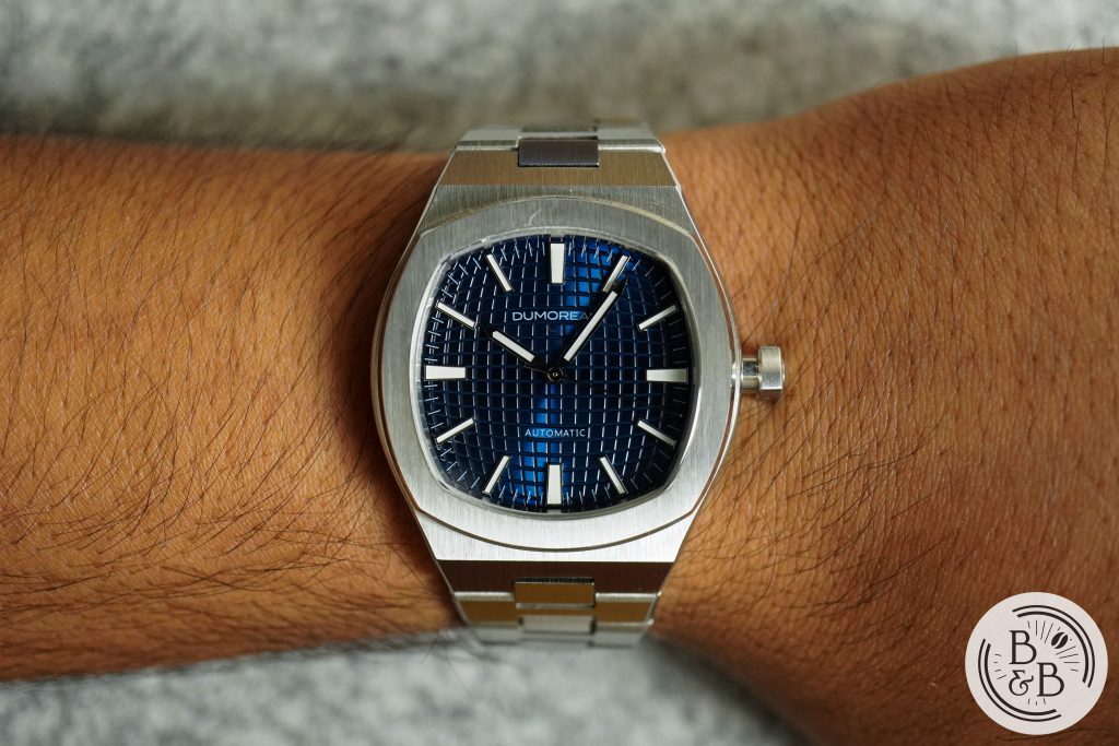
The 39.5 mm diameter and 45.9 mm lug-to-lug width wear great on my 6.5″ wrist and I have no complaints at all. The height of 10.3 mm is great too, and the recessed case flanks help make this watch look even sleeker than it is. A nod to the Czapek Antarctique, perhaps?
Concluding Thoughts
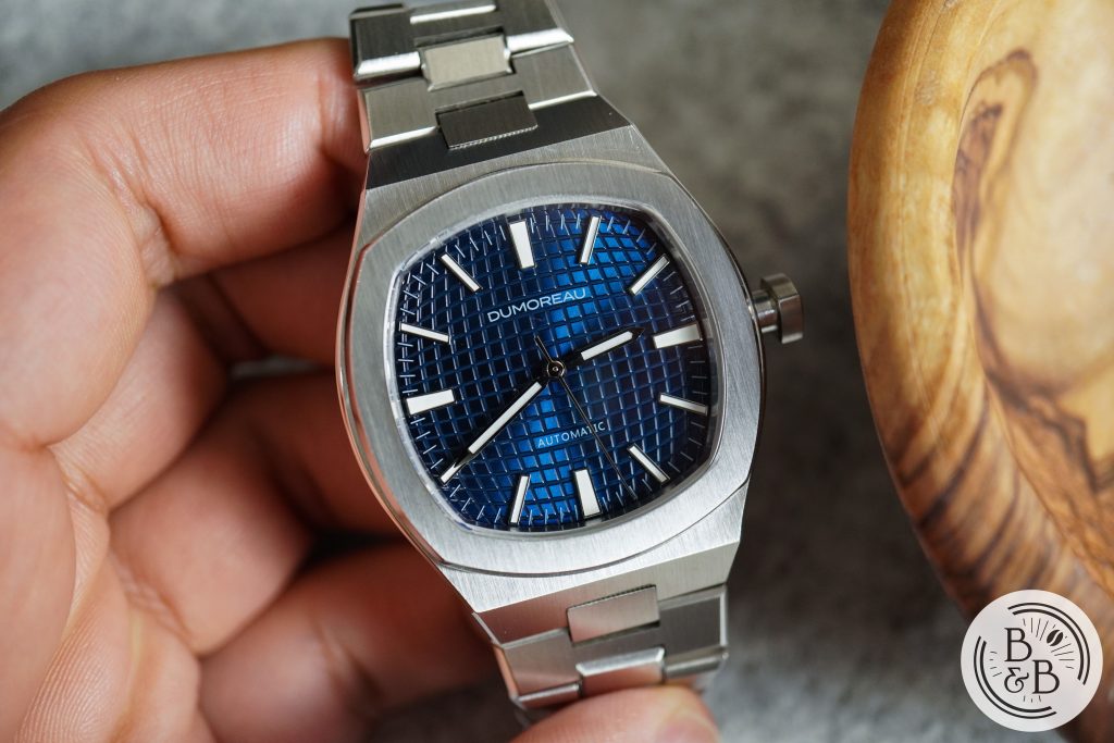
To wrap this up – I think this is a well designed take on the iconic Gerald Genta design style. It borrows heavily from his most successful watches. This watch pays homage to that design language, and is more true to the original definition of the word homage, instead of what is used to pass of lazy rebranded clones. If the idea of a homage watch is appealing to you, I recommend checking this one out. The price is reasonable, the design is good, it wears well and it is well built. Apart from the small fiber under the crystal, the quality control seems good too for the $400 price.
Thanks for reading!

