Disclaimer: I purchased this watch pre-owned and was not externally incentivized in any way to make this review. This review is in no way sponsored by any entity. All opinions here are my own. Since this watch was worn/used for a year, please make note that the experience might differ slightly from that of a brand new watch.
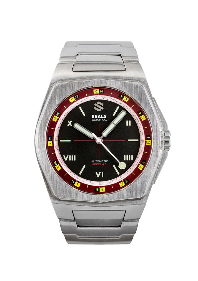
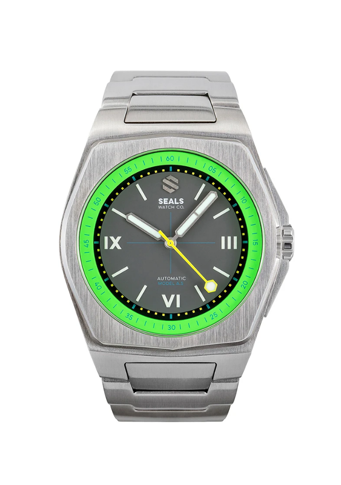
Note: This watch is the Model A, and not the Model A.5, which is their latest offering. I haven’t experienced the Model A.5 in person but I will try to list the improvements that Seals appear to have made between the Model A and Model A.5.
Case
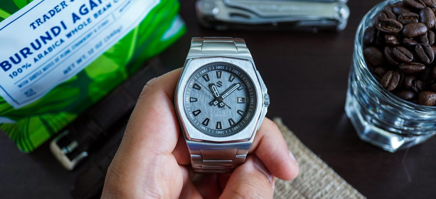
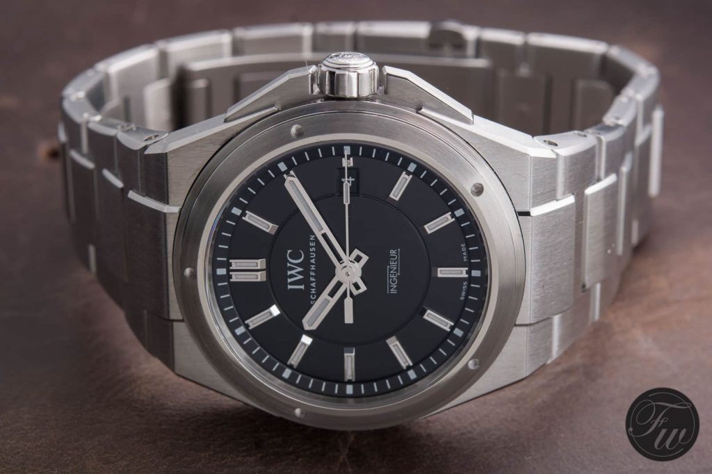
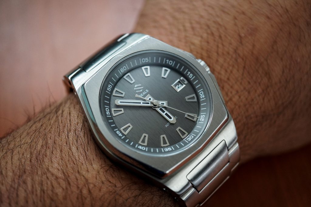
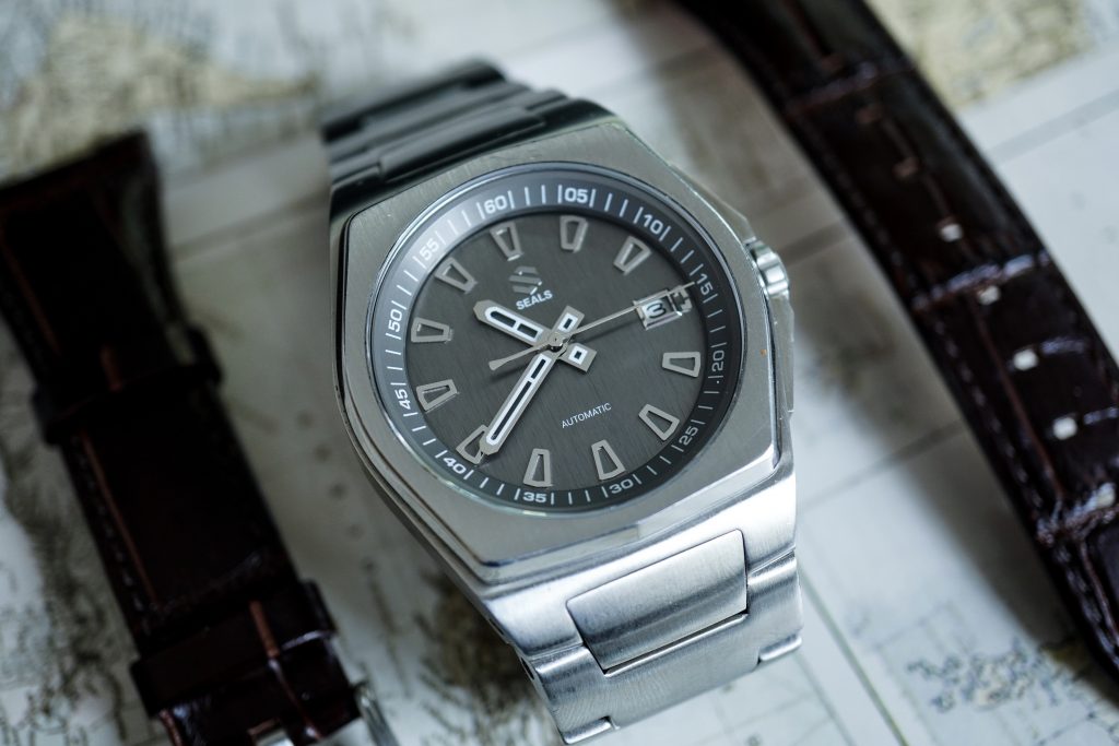
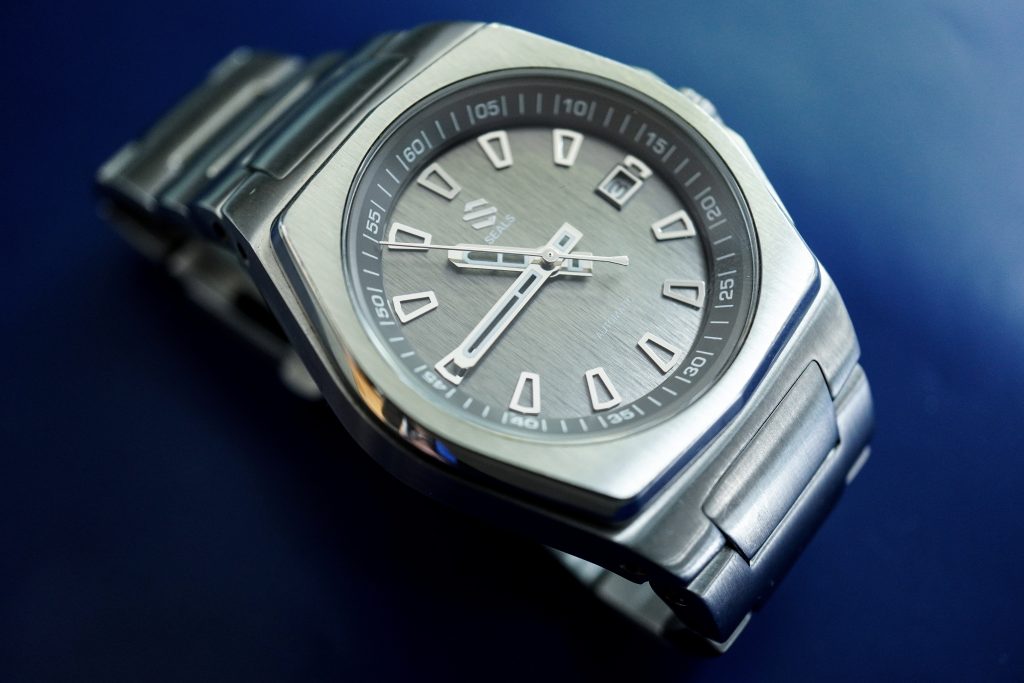
On their website, the design inspiration for this watch is stated to be tanks from the 1940s. While there are plenty of similarities between this watch and the rectilinear construction of tanks from that era, you can’t help but immediately draw similarities between the Model A and some of Gerald Genta‘s popular work. This watch reminds me quite a bit of the IWC Ingenieur 3239, and I say that as a compliment. When you pick up the Model A, you quickly understand why it sets itself apart from all the Genta wannabes and, to an extent, has made a compelling argument to define it’s own identity within the world of micro-brands.
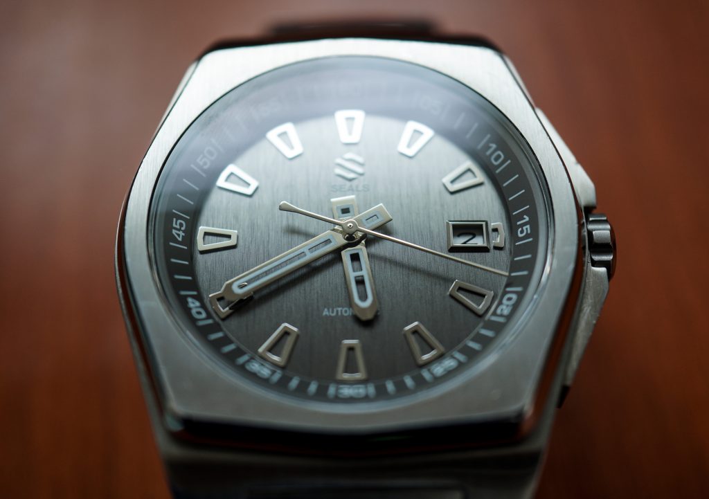
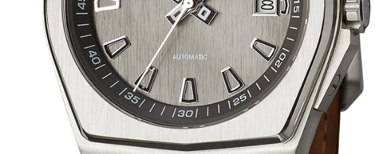
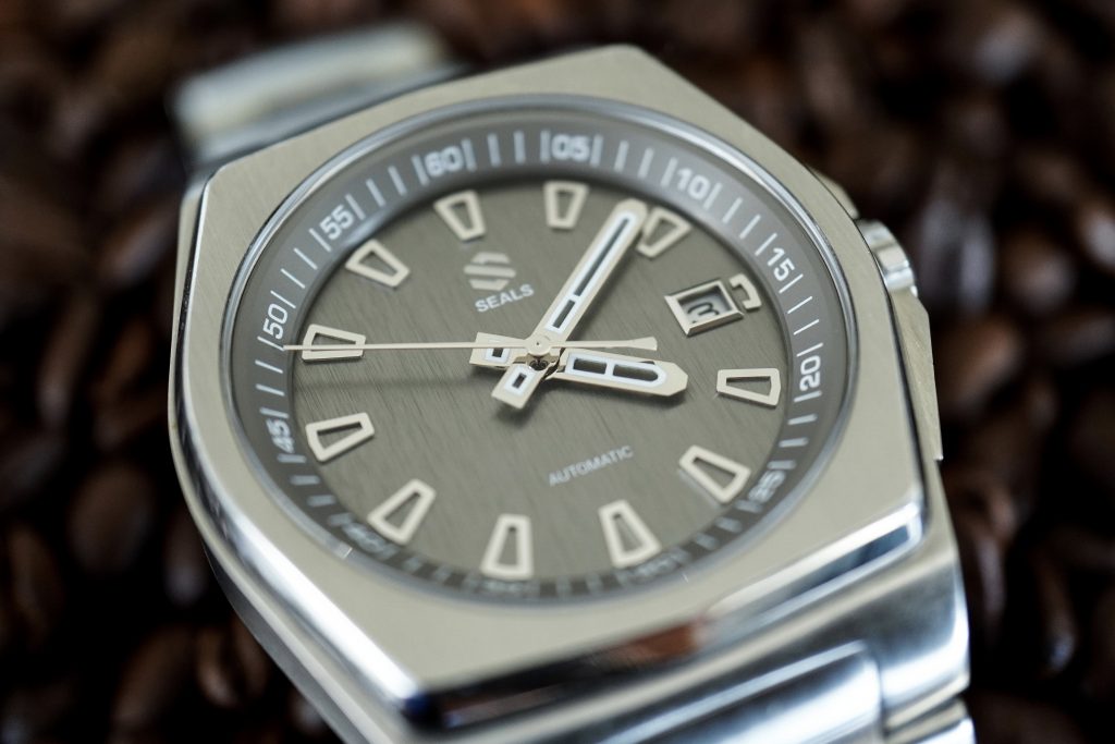
The case perfectly defines the overall bold wrist presence of this watch with it’s straight edges and dramatic angular surfaces. The case draws all it’s attention from the 3mm fixed bezel, that is brushed on the top to match the rest of the case, but is high polished on the sides. This high polished surface gives the watch tons of character, and catches light in a similar manner to the Royal Oak‘s bezel. The dial sits at the bottom of this 3mm bezel height, giving the dial an immersive sense of depth.
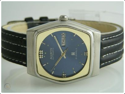
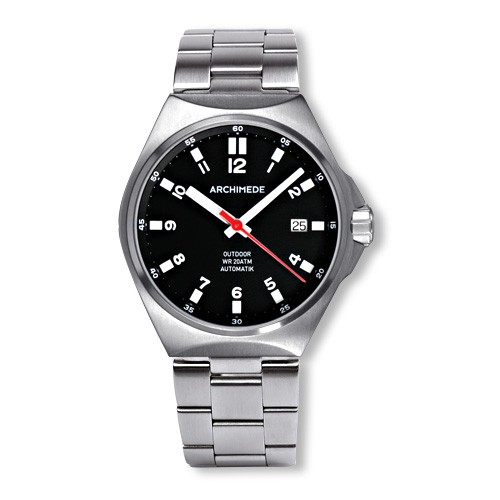
The bezel is an octagon, with the top and bottom pairs of sides being less pronounced than the sides. The whole bezel and case design screams 1970s watch design and I love it. Some folks have drawn parallels between this watch and the Archemede Outdoor. I see 70s inspiration in both watches, but the Outdoor is a lot less aggressive, with it’s softer edges and less pronounced angular surfaces. I’d say the closest overall resemblance is to the IWC Ingeniuer 3239, both in terms of dial simplicity and case design. This watch also reminds me a bit of an Allwyn watch that I recently came across, from the 70s. This Allwyn design is likely to have been borrowed heavily from a more popular brand at that time. Allwyn used to be a popular brand in India during the 80s and 90s.
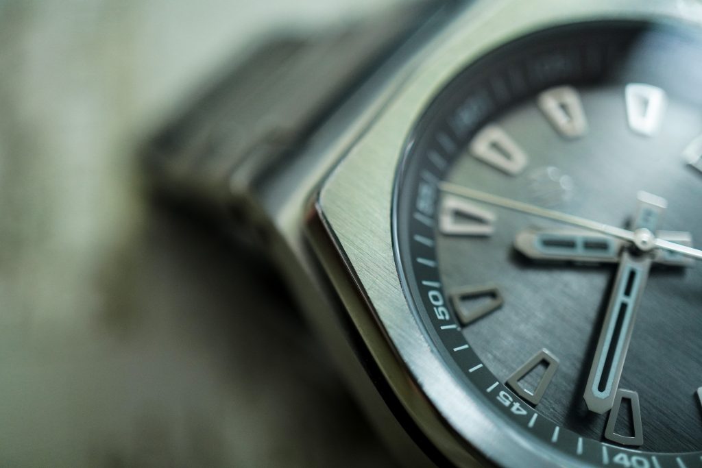
The previous (original) owner of this watch had it for a year before selling it to me. It appears that he has put it through it’s paces and this monster of a case has held up very well, accumulating a few battle scars but no serious damages. In my opinion, this what a watch should look like after aging gracefully.
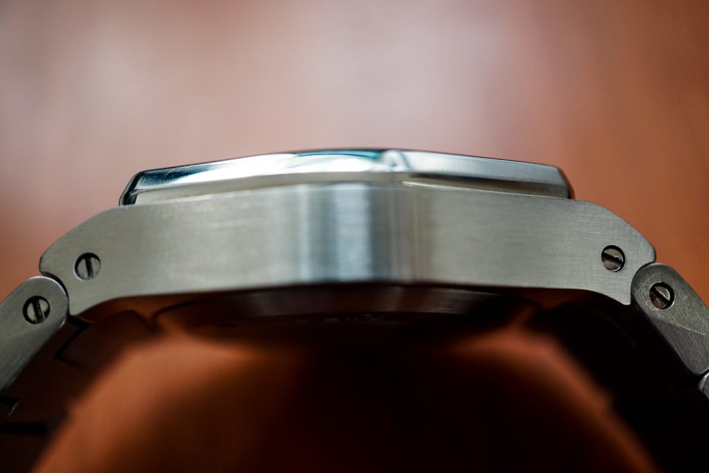
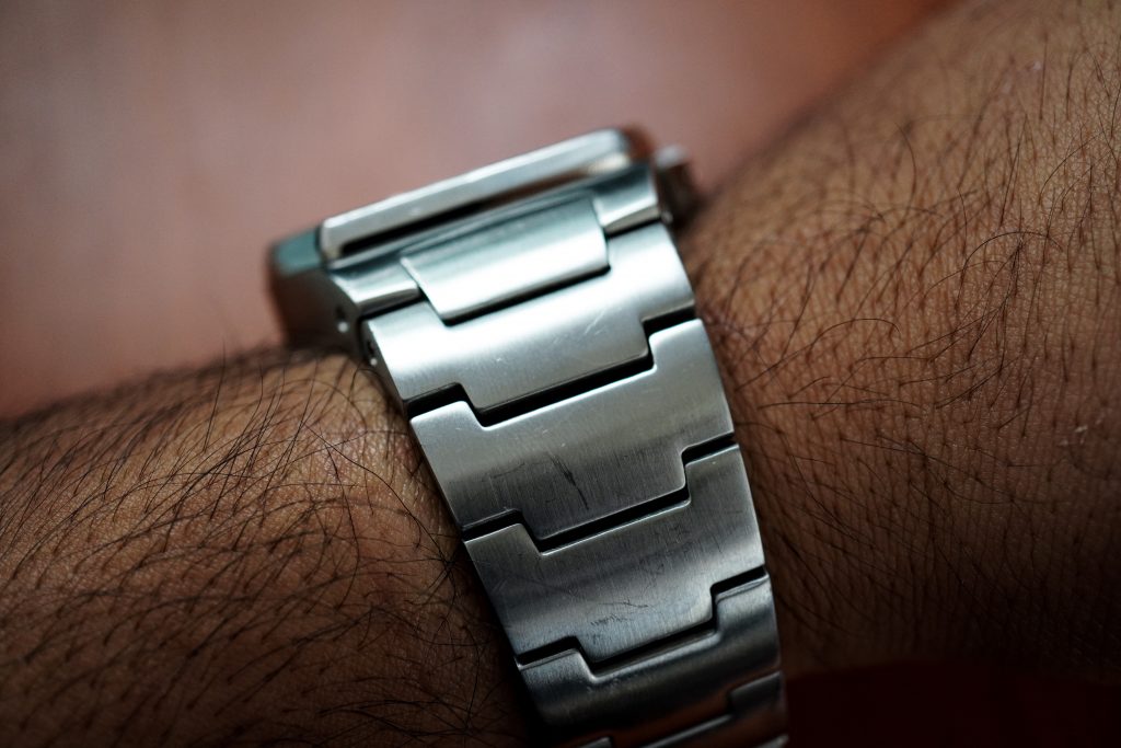
The case elegantly and effortlessly extends into it’s integrated metal bracelet. This watch also shipped with a leather bracelet which looks well made and looks great on the watch.
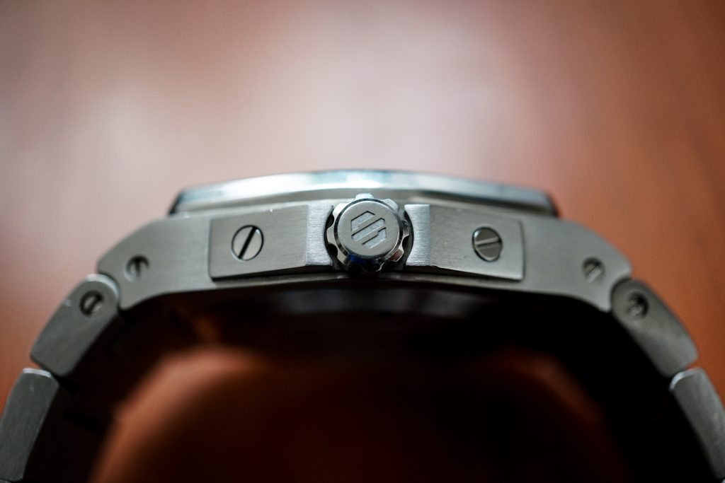
The crown guards are very similar to the IWC Ingeniuer 3239, but work perfectly with this case design. The crown guards protect a very short crown that is decently designed, but not the easiest to grip and adjust. A slightly thicker crown might’ve resulted in a more ergonomic experience.
In terms of the case design, the Model A and Model A.5 appear to be identical. The A.5 is 0.55mm slimmer than the Model A according to their website, but from experience this half millimeter isn’t going to give you a drastically different wrist experience on a watch as hefty as this one.

Dial
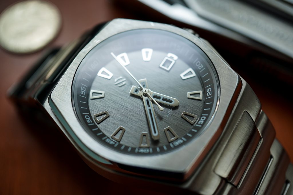
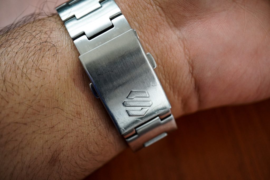
The first thing that struck me after looking at the dial was the logo. The symbol looks uncomfortably close to the Suzuki logo. Growing up in India with every 3rd car on the road being a Suzuki, I couldn’t unsee the similarity.
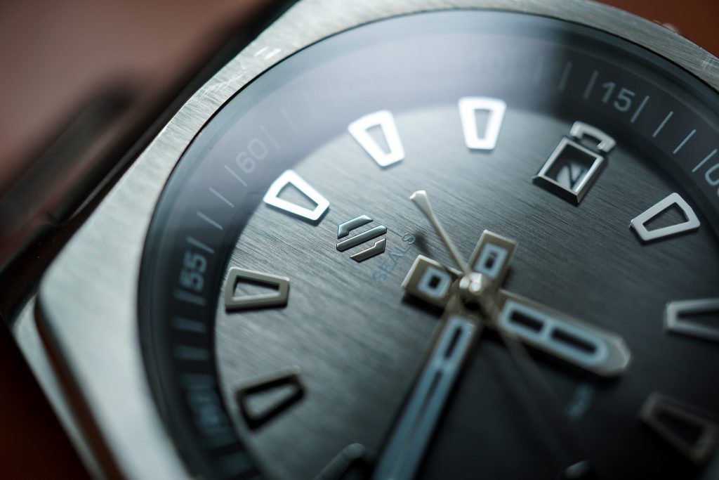
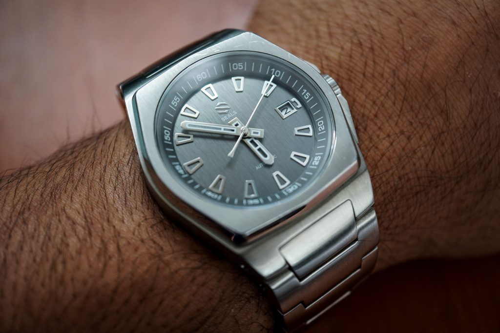
But once you get past that irrelevant fact, what you’re left with is an extremely well designed dial. Even though the watch chooses to define itself by the case and bracelet design, the dial to me is the best aspect of this watch. The entire dial has been put together by someone who knows design. This is not a simple “pick from a catalogue and send to Shenzhen” dial design. The difference in depth between the glass and the dial is elegantly balanced by a clearly visible rehaut that wonderfully directs your attention to the slate dial below it. The seconds hand extends just a millimeter over the rehaut, making it extremely easy to time the seconds hand to a good degree of accuracy. Extremely practical design execution!
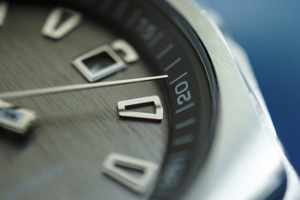
The high polished metal hour markers are applied to the dial and lack lume. The hands are a bit controversial – the minute hand extends over the hour markers and once again indicates the desire for easy legibility. The hour hand is short, but doesn’t take away from the overall easy legibility of the watch. The hands are skeletonized with an extremely small amount of BGW9 Super LumiNova applied to it.
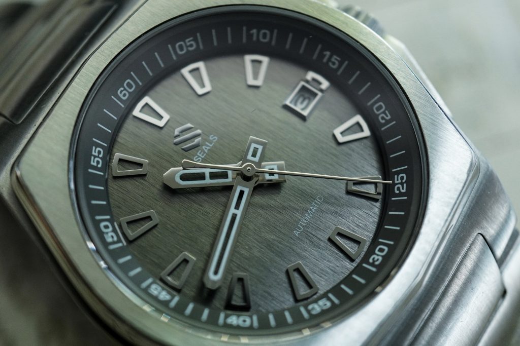
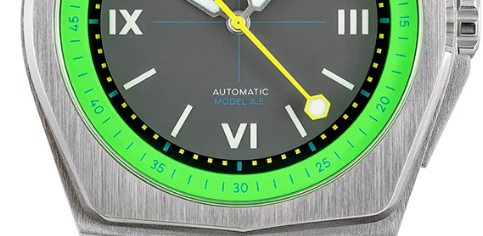
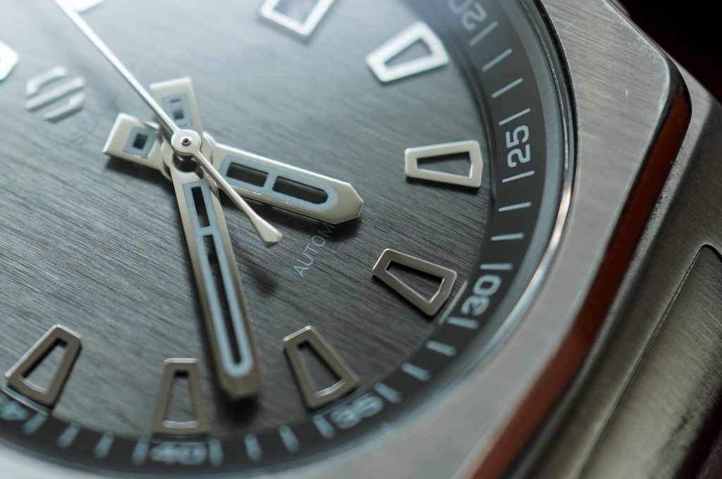
I’m not entirely sure what the purpose of this was, considering it is almost invisible in the dark, with an extremely faint glow that disappointingly only lasts a few minutes. I would have preferred if the lume had been removed completely and the open-worked hands left as is. It does appears that the people voted and lume was made a priority, because the Model A.5 has better lumed hands. Unfortunately, the seconds hand has also been changed on the Model A.5. The Model A’s seconds hand is one of the best aspects of this watch. The way the seconds hand hovers over the rehaut just screams class. The A.5 seconds hand looks ridiculous in my opinion.
The vertically brushed slate dial on this watch is gorgeous. Unfortunately, it appears that the rest of the community didn’t share these sentiments because the Model A.5 has simpler and more boring dials. Again, another aspect of the Model A that I love has been left out of the A.5 :(.
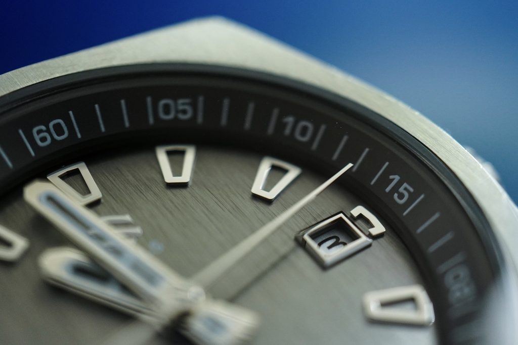
The date window does a decent job of blending into the dial, with a beautifully polished window that sits next to the remnants of the hour marker whose place it currently occupies. The Model A.5 has done away with the date window, but that’s ok. The Model A is a (luxury-) sports dress watch, similar in spirit to the Royal Oak. And the dial is perfectly designed for a watch in that category (minus the oddly lumed hands).
In terms of overall dial design, the Model A and Model A.5 couldn’t be any more different. The A.5 appears to be catering to a completely different audience with it’s colorful and eccentric designs. The Model A is more conservative and more in line with the luxury sports and dress watch aesthetic that I believe this watch was going for. The Model A.5 “Michael Knight” is the most subdued of the three and could potentially substitute for a Model A under desperate circumstances, but is more casual than the Model A.
Bracelet
The bracelet design helps this watch distance itself from the Gerald Genta wannabes. Personally, I would’ve actually liked to see more angular surfaces and straight lines on the bracelet, but instead each individual link is smooth and slightly curved. It does looks good and the watch is able to pull off these over-sized brutish links.
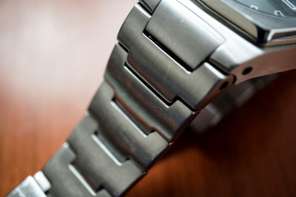
But as with a lot of integrated bracelets the articulation on the fixed links is quite poor. On my 6.25″ wrist, this watch is at it’s minimum wrist size, and barely conforms to my wrist completely. Those with 6.5″ wrists and larger shouldn’t have a problem, but I cannot recommend this bracelet/watch to anyone with a wrist size under 6″. It is unfortunate that the end links were allowed to articulate so poorly, because if they were allowed to rotate by just another 10 degrees, it would allow the whole bracelet to conform to smaller wrists such as mine.
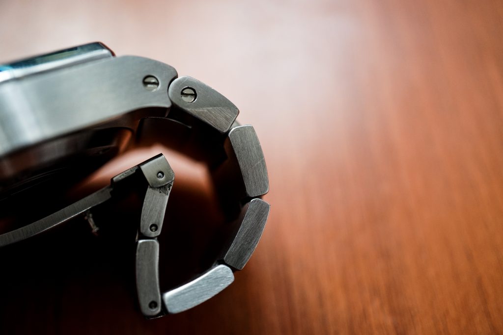
NOTE: They measure the lug to lug distance between the screws on the first end link, while I have measured it roughly between the ends of both first end links.
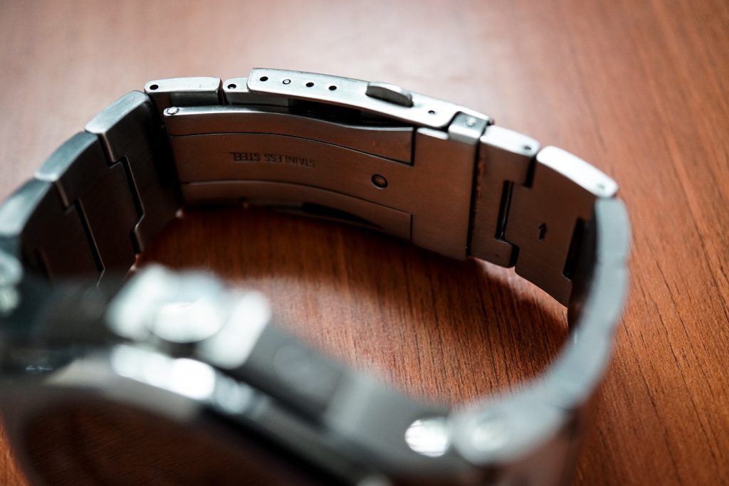
The clasp is ordinary, and for a watch that costs $800, is a bit of a let-down. It does have 4 micro-adjustment slots, which definitely earns some points in my book. I like that they used a regular clasp design instead of a butterfly style clasp. This bracelet and clasp design allows you to measure up your wrist quite well and get a reasonably comfortable fit. A small irrelevant note – I’m used to having clasps with the logo positioned on the button-side of the clasp, so this threw me off a little bit. Overall, this watch is has quite a hefty wrist presence, partly due to it’s roughly 185gm weight.
Movement
This watch has a Miyota 9015, and I’ve had good experiences with that movement. At a price of $800, it is harder to digest but at the pre-owned price this is an easy win, considering alternatives are mostly Seiko NH35 equipped timepieces like the D1 Milano Automatic I just reviewed (which retails at $625 but apparently can be had for cheaper).
The crown and stem feel a bit delicate. I would’ve liked to see a more robust crown support design. This felt a bit lacking and more like a $300-$400 watch, rather than an $800 watch.
I’ve logged the accuracy of this watch over a 3 day period and observed an accuracy of +8spd. Given that this watch has been used for the past year, the slight deviation is understandable and quite acceptable. I suspect if regulated, this watch can hold on to tighter accuracy ranges.
Concluding Thoughts
This watch feels like quality and certain aspects of this watch appear to have been meticulously and painstakingly designed by someone who understands watches. Unfortunately there are some oversights in this design (more so the engineering of it), such as the poorly articulating end links and the impractical lume on the hands. That said, if my wrists could better pull of this watch I would definitely consider adding one to my collection. On the wrist, this watch is a convincing substitute for something like an IWC Ingenieur. It has the silhouette and the hefty design to pull that off, coupled with the well designed and well executed dial.
According to Seals, this watch is made with high quality components sourced from China and India. It is still unclear to me whether this watch is assembled in the United States or not. That said, judging by the finishing on the dial and case, their QC appears to be spot on so where it is manufactured/assembled shouldn’t matter.
Pros:
- Familiar design language, but does not look or feel like it’s trying too hard to be a watch that it isn’t.
- Versatile dial design (unlike Model A.5) and beautifully executed finishing
- Seconds hand and rehaut design are fantastic (unlike Model A.5)
- Aggressive wrist presence and looks very imposing on the wrist, similar to an IWC Ingenieur
- Excellent value at the current pre-owned prices ($300-$400)
Cons
- The bracelet design is not ideal for wrists under 6″, even though smaller wrists could pull off the rest of the case dimensions if not for stubborn end-links.
- Lume on the hands isn’t really practical and should have been removed completely.
- Crown is a bit too short and could’ve used another 1mm in height for better grip.
- Appears to not hold it’s $800 retail value and can be found on the pre-owned market for anywhere between $300-$400. I’m not sure I would pay the $800 for this watch or the Model A.5, but at $300-$400 pre-owned, this is an excellent purchase provided you can live with the other points mentioned here.

