Disclaimer: this video/review was not sponsored by Seiko or any other entity.
Strap Featured – Artem HydroFlex 20mm Grey – https://artemstraps.com/products/hydroflex-grey-hybrid-fkm-watch-strap-with-grey-stitching?variant=40120190304291
Video
Review
Seiko, a name that resonates deeply within the horological community, hardly requires an introduction. Whether you’re a novice or a seasoned collector, the chances are high that you’ve encountered, if not owned, a Seiko… or multiple. This year, Seiko introduced a refreshed lineup of their Samurai watches, sparking mixed reactions among enthusiasts. The update has polarized fans, stirring a blend of admiration and disapproval in equal measure. And it appears to be taking on a rather unappealing nickname, the “Shogurai”.
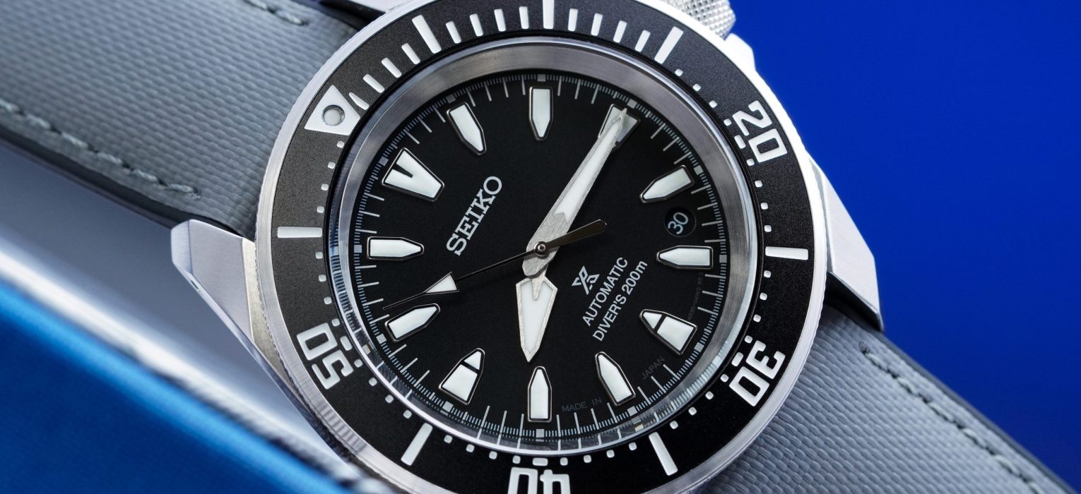
As someone who appreciates the more angular designs of Seiko (Samurai, Shogun, etc) and Grand Seiko (SBGV245, SBGX339, SBGX341, SBGA481, etc) , the Samurai series has always caught my eye, though I hesitated due to its traditionally larger size. The announcement of a reduced case size in the latest iteration piqued my interest, compelling me to experience it firsthand. Although this new Samurai, specifically the SRPL13 (or the Japanese SBDY131) model with its sleek black dial and steel case, has elicited varied opinions from critics – mostly negative due to the design choices – I find the aesthetic very appealing. The main contention for me lies in the pricing. Retailing at about $575 USD, and typically available with a 20% discount bringing it down to around $460, the cost still feels steep at $485, which I paid, especially when considering the actual components and quality offered.
Let’s get into the details..
Case
The Samurai SRPL13’s case design is a compelling mix of tradition and modernity, standing out in my collection. Measuring 41mm in diameter (similarly measuring 41mm across the bezel), 48.5mm from lug tip to lug tip, and a thickness of 12.35mm with a 20mm lug width, the case is made from stainless steel, featuring an angular design that nods both to previous generations of Samurai and Shogun watches. However, the quality of the case’s brushing falls short of expectations, especially when compared to other $600 micro-brand watches. The lugs exhibit coarse brushing with slightly irregular edges, lacking the meticulous attention to detail one might hope for, particularly when contrasted with the exceptional finishing of sister company Grand Seiko.

Despite these shortcomings, the overall case design significantly influenced my decision to purchase this watch (if if only to use for a few weeks). The mid-case is slim, and the sharply angled lugs, which extend slightly beyond the case-back, provide an aggressive yet ergonomic profile that comfortably wraps around the wrist. The drilled lugs facilitate easy strap changes, which I suppose will be a commonly utilized feature given the relatively mediocre bracelet.

The bezel and crystal contribute approximately 4mm to the case’s thickness. The bezel, featuring Clous de Paris style knurling, is somewhat slippery, although it operates with a satisfying elasticky click typical of Seiko’s 120-click unidirectional dive bezels. The bezel insert, possibly aluminum, features high-contrast white markings and a lumed pip at the 12 o’clock position. Its design, reminiscent of vintage Rolex Submariners and echoing the aesthetic of the new Tudor Black Bay 41 Monochrome, is particularly appealing.

However, the use of hardlex crystal over a more desirable sapphire at this price point is disappointing, feeling more like a cost-saving measure than a thoughtful design choice. I would be more likely to appreciate a vintage inspired hesalite or plexiglass crystal if executed correctly. The 5.8mm screw-down crown at the 3 o’clock position matches the bezel’s knurling, providing easy operation and secure threading – a notable experience for a lower end Seiko.

The watch is completed with a typical Seiko closed case-back, screwed down and embossed with artwork, contributing to its 200m water resistance rating. This design is modern, sharp, and feels robust, and appears to be a mix of previous Samurai and Shogun watches, albeit with some corners cut in component choice and finish.
Dial
The Seiko Samurai SRPL13 presents a beautifully executed dial, featuring a subtle sunburst style black finish that elegantly plays with light without overwhelming the viewer. This variant is part of a lineup that includes the striking red bezel / red dial / steel case SRPL11 and the vintage-inspired SRPL15 with a black bezel / black dial / black case, each offering a unique aesthetic. The SRPL13’s dial base is delicately finished, achieving a monochromatic aesthetic reminiscent of, but distinct from, the sunburst effects seen on models like the Tudor Black Bay Monochrome.

The outer minute track is meticulously printed with bold rectangular markers at five-minute intervals, and precise ticks for each minute and second, showcasing exceptional print quality without any flaws such as smudging or incomplete paint. The hour indices introduce a new design, drawing inspiration from earlier Samurai, Shogun, and Monster models, featuring sharp contours and generous lume filling that enhance legibility under various lighting conditions.


The date window, neatly placed between the 4 and 5 o’clock indices, integrates seamlessly with a color-matched date wheel that complements the overall dial aesthetics. The brand’s logo is printed below the 12 o’clock index, but the (polarizing) Prospex logo above 6 o’clock utilize a generic typeface that feels uninspired, detracting slightly from the dial’s otherwise impressive design.


The hands of the SRPL13 are particularly impressive for their proportions, legibility and refined finishing. They mark a departure from the more angular hands of previous generations, featuring large lume plots that ensure readability. The polished seconds hand, with its large triangular lume plot, adds a functional elegance to the overall design.


Overall, the SRPL13’s dial is an excellent example of Seiko’s capability in creating visually engaging, highly legible dials that maintain aesthetic appeal and practical functionality over time. Despite some minor criticisms regarding typeface choices, the dial stands out as a strong point in the watch’s design and I think this design aesthetic will age very well in the Seiko catalog.
Lume
The Seiko Samurai SRPL13 boasts a generously lumed dial, a standout feature that adds considerable value. Each of the large indices is filled with Seiko’s LumiBrite mixture, ensuring visibility in low light conditions. This includes all three hands and the twelve indices, aligning with the stringent ISO requirements for dive watches. Historically, Seiko’s LumiBrite was renowned for its superior performance. However, recent years have seen a shift towards a more cost-effective lume formula in their less expensive models, leading to performance that often barely matches, rather than exceeds, that of its competitors within the same price range.

The trend across modern Seiko watches has been a disappointing decrease in the longevity and brightness of their lume (SPB355, SRPK17), especially when compared to their older or more expensive dive watches (SLA053, SPB207). It’s becoming increasingly rare to find a Seiko watch that maintains the brand’s historically high lume standards without venturing into the $2500 and above price bracket. Despite this, the lume on this particular model of the Samurai appears to be a step up from recent offerings. While it may not rival the top performers from dedicated micro-brands known for their exceptional lume, the SRPL13’s lume is notably good, offering sufficient brightness and longevity for everyday use. This suggests that Seiko may be taking steps to address and improve the lume quality in their more accessible models.
Movement
I’ve lost count of how many watches I’ve reviewed with the Seiko 4R35 (or the NH35) and my opinion has mostly remained unchanged – Seiko needs to do better. These movements feel underwhelming to operate, the accuracy is hit/miss, the architecture is dull and the upward creeping prices of Seiko watches that use this movement make it almost entirely unacceptable as a movement offering. Seiko’s official tolerance for this movement stands at +45 spd to -35 spd – a range that feels ridiculously lenient for 2024. But somehow Seiko still manages to sell enough of watches with these movements, and sometimes the design is attractive enough even for me to overlook my disdain for this movement.
This particular watch has kept reasonably good time, at around +8spd, but that doesn’t change the fact that Seiko is unwilling to tighten their commitment to movement performance on a watch that has an MSRP of almost $600 USD. That is within ETA2824/SW200 equipped micro-brand watch territory, and certainly within Miyota 9 Series territory, which are all notably better regulated with much tighter performance bounds. The silver lining, if there is one, is that this movement is inexpensive, easy to service and replace entirely, and is sufficiently robust.
On The Wrist
The Seiko Samurai SRPL13 offers a wear-ability that feels tailor-made for my 6.75″ wrist, thanks to its 41mm case diameter, 48.5mm lug-to-lug width, and 12.35mm case height. This watch strikes an excellent balance in proportions, delivering a noticeable yet comfortable presence. Compared to previous iterations of the Seiko Samurai, the latest model sports more angular and down-turned lugs, resulting in a more compact appearance and comfortable fit. The lugs slightly extend beyond the flat case-back and contributes to a lower center of mass and stable fit on the wrist, which I love in a case design.


However, the stainless steel bracelet doesn’t impress me much, appearing lackluster in both design and build quality. While the cohesive flow between the bracelet and end links is commendable, the overall execution is underwhelming with a noticeable amount of wiggle at the end links and a pretty unremarkable fit, common to many Seiko and Grand Seiko offerings. The bracelet’s mediocre brushing mirrors the case quality, and the clasp, lacking micro-adjustments and featuring a basic stamped construction, feels entry-level despite the inclusion of a dive extension that remains superfluous for everyday wear… at least for inactive desk divers like myself. But I can respect Seiko’s commitment to retaining some of the more utilitarian elements of dive watch design in their dive watches.

Although the watch case design enhances wear-ability, the overall quality of the bracelet and its limited adjust-ability detract significantly from the experience, relegating what might have been an exceptional wear-ability express to merely a “good” one. I appreciate Seiko’s continued use of drilled lug holes though, which simplifies the process of replacing the bracelet with a more premium strap for those of us less enthusiastic about the original bracelet.

Wrapping Up
To conclude, the Seiko Samurai SRPL13 is a handsome watch with its visually appealing design, sharp aesthetic cues, and well-proportioned build. The lume performance is commendably above average, and the bracelet design and integration marks a positive departure from typical Seiko offerings. If you’re looking into buying one of these watches, be aware that most of your money is going towards the design and the Seiko branding. I never thought I’d be saying that, since Seiko has historically been the underdog brand that put value ahead of branding and product positioning, but this is the new normal and it’s time we get used to it, I suppose.

This transition in Seiko’s approach might require long-time fans to adjust their expectations as the brand evolves. The use of hardlex crystal, the 4R35 movement, a stamped clasp, along with the mediocre finishing and less-than-ideal bracelet tolerances, somewhat diminish the watch’s overall appeal. These elements suggest that Seiko may be moving away from its roots as a value-driven, enthusiast-focused brand. For those prioritizing high specifications and superior build quality in the $500 range, alternatives like Zelos may offer more satisfying craftsmanship and value.


